Thursday, 17 November 2016

Creating a Film Trailer using After Effects

During today's Process and Production session, I had Sara, developing my skills in After Effects, a programme I was introduced recently. A recent animation I put together using this software, included changing coloured slides to beats in the audio I downloaded. However this session involved me creating a short, 10 second book trailer of my choice. I already had pre-made slides to take to this session, as I had decided on a book I wanted to use earlier in the week. 

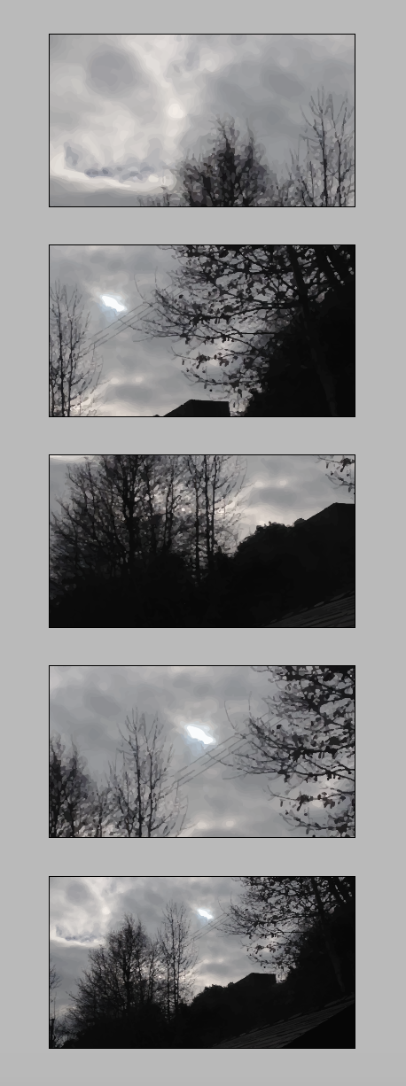
The name of the book I wanted to turn into a short trailer clip was Girl on the Train. I recently saw this at the cinema and knew its tones and emotions well and clear - helping me put the trailer together. To begin with I set up an inDesign document using the correct dimensions, and took a picture that I had recently photographed to use as a background image throughout my animation. I adjusted the image so that it was a dark, gloomy grey scale setting, and also image traced the photograph to a high fidelity setting - this made the photograph more geometric rather than realistic. Once the image was adjusted, I used different sections of it for every slide, and on the 10th slide, it presented the whole image. I have screenshot a few examples of my slide background and placed them on the left. 

I created a slide for each second, with quotes, phrases, authors name etc on each one. I used a light colour for the text to contrast against the darker imagery, and the font was a light weight typeface, used in both lower case and upper case, as seen in my Vimeo link below.

I came across a slight problem after adding all ten slides into my animation to play them back. I noticed that having a slide a second was much too fast for the audience to keep up with - some slides had two lines of text included. It was visibly difficult to read when the slides were changing so quickly, so I adjusted the amount of slides I used. I also deleted text and shortened my phrases for a more sharp, snappier effect. I now have seven slides over a 10 second time period, and I have added one fading motion in to a slide half way through. 

Film Trailer - Gone Girl from Emily-Beth Phillips on Vimeo.

I think my background image works well, and the text is suitable for the imagery - subtle so it does not over power in front of the edited photograph. I think if I had more time to decide and look into, I would change the audio I have picked, there were no beats to the piece, so it was difficult for me to decide when the slides were changing and how long I should give them all. However I am happy with my first proper motion graphics animated video.

Multiple Perspectives - Demonstrations of Differences

This morning's seminar followed on with ways in which to help build the best assingment I can achieve. The topic today was perspectives, and how looking at things from different angles can build a whole new world. The exercises and speeches we were given in this seminar helped me realise that whilst writing my assignment, there will always be more ways to look at different pieces of information I will be jotting down. There is never one straight route that I have to follow, there is always other directions I can lead and new ways of thinking will become apparent.
Nothing is unchanging, internal or timeless. Therefore, there is no absolute 'eternal truth'.
No absolute politics, life, ethics, morality, truth, goodness.

We watched the Shimmer suit video online, it represented new dynamics, and how we are always looking at something different that is constantly changing.


Another video we watched to represent multiple persperctives was the points of view video found on youtube. It shows how we change our understanding depending how which angle we look at something, and we never know the full truth, there is always more to be found. There is no whole picture to get, there is always too much going on. 


To round the seminar up, we took part in two exercise with the rest of the class. One, we watched a video up to around a minute and a half long, then got split into four groups. Each group had 20 seconds of the video to focus on, to share in their own words their understanding of the scene. We all had different views on what happened at different parts of the video. So depending on which part you were focusing on, it had a completely different storyline.

The final exercise included looking at different sides of a box form different angles, my side displayed a piece of paper with a man walking away. Other sides had different objects attached, we looked into angles, reactions, and perspectives from all different people.

Monday, 14 November 2016

Type

Type is the physical embodiment of a collection of letters, numbers, symbols. Anna went through a number of examples today, displaying different types of typography and typefaces, explaining how they range, sometimes due to the date of creation. First of all, we looked into Jan Tschihold, The New Typography, (1928). This was a handbook that started a movement, it was really influential towards modern designers. It rejected the normal way of using columns and other types of layout; before this book, type was not that significant. It was an accessible handbook that was not too academically demonstrated. It influenced other books, magazines, brochures etc.

Personal Research: 
Further research into The New Typography book, helped me find that Jan Tschihold took his lead from currents at the Weimar Bauhaus, he then codified the movement with accessible guidelines is his book. Almost over night, typographers and printers adapted this way of working, from business cards and brochures to magazines and advertisements. 

Image found at (https://www.amazon.co.uk/New-Typography-Weimar-Now-Criticism/dp/0520250125)


This book was organised around the following principles:
  • Asymmetric balance of elements
  • Utilisation of white space
  • Sans serif typography
  • Advocated lower case letters
  • Supported the typo-photo approach
  • Content was designed by hierarchy
After looking into Tschichold's handbook for modernised layouts and typography, Anna went on to talk about 'Fameux sans serif' from the bauhaus: created by Herbert bayer, universal, 1925.
This was a type of font that was simple for a machine layout, cheap to produce, easy to read and legible. It did not use capitals, and it stood alone as a universal typeface.


Image found at: http://www.designhistory.org
/Avant_Garde_pages/BauhausType.html


I have looked at Theo H. Ballmer, 1928 - he was a Swiss graphic designer that produced a clean and clarity typeface just like the example above. Neues Bauen is a hand done typeface that was presenting in an exhibition. It contains only capitalised letters for a bold, legible style, perfect for creating posters with, just like my example below. 


Image found at: http://www.eyemagazine.com/feature/article/swiss-radica

Joseph Muller- Brockman, produced a clear sans serif typeface,  it is blocky, and he utilises lines. It is very apolitical, with no baggage. He uses abstraction in his work. Brockman was also influenced by the Bauhaus movement, and he is one of the most well known Swiss Designers. This poster below for the Zurich town hall is probably his most recognised piece of work.  


MÜLLER-BROCKMANN Found at: http://www.designishistory.com/1940/joseph-mueller-brockmann/

I looked at kinetic type:
Kinetic type is an animation technique, it mixes motion and text together to express ideas through a video. The text presented in the animation video conveys a particular idea or emotion. 
  • Words appear in an order
  • TV adverst, blogs, landing pages
  • From paper to screen
Personal Research:

Saul Bass, worked with hollywood film makers. He made a title sequence for the man with the golden arm. In Bass’ own words: 


“My initial thoughts about what a title can do was to set mood and the prime underlying core of the film’s story, to express the story in some metaphorical way. I saw the title as a way of conditioning the audience, so that when the film actually began, viewers would already have an emotional resonance with it.”

It is a very creative way to present pieces of text, is becomes memorable and the music used ties in with the motions, creating a recognisable piece of music also. 

Seminar and Personal Work:


The seminar following on from the Type lecture, focused on a Stencil typeface, created by Joseph Albers in 1926. Albers wanted a style that was very simplistic and easy to read, a very legible typeface, so he produced a stencil for the alphabet, using only 10 simple shapes. We were given the task of displaying examples of the letters, I have put together my results (shown above). Most letters were easy to produce and put together, however others did not work quite as well, proving difficult to use with the modern day alphabet. Although it was proven difficult in some cases, this stencil design is very stylish and does present a very contemporary typeface. 

Albers taught at the Dessau Bauhaus, there he designed a series of stencil faces. Before his teaching years, he was a student at the Weimar Bauhaus. 


 The typeface I looked into in the seminar is based on a limited palette of geometric forms combined in a size ratio of 1:3. Drawn on a grid, the elements of square, triangle, and circle combine to form letters with an economy of form. His idea was never intended for text, he wanted the face to be used on posters and in large scale signs. I can understand why this text wouldn't work on a smaller scale, used as body text perhaps. The shapes in the typeface and very precise and work better when enlarged.


Thursday, 10 November 2016

Introducing Phase Two

Phase one of the Foundation Studio Practice module including creating my sketchbook full of primary and secondary research. It needed drawings, text, images, artist, examples, inspiration. This was formatively assessed on the fourth of October, so we are now moving forward with phase two - Place making. Using my research from my sketchbook I need to begin to think about writing a proposal that includes ideas from my gathered information. This lecture was to give us a guide as to what will be coming next, as we got given a brief hand out to read through and note ideas down. I Started establishing a rationale, describing project ideas and concepts, and the reasons for wanting to do them. I looked into themes, intentions, audiences etc. 

Perspective Drawing - Interior Studies

Today's Process and Production session was with John, focusing on drawing from different angles, perspectives, and areas, similar to the last drawing session. However this week we stayed inside the university and drew different sections throughout the creative arts building. We had a range of material in use, from fine liners, to crayons, to charcoal and water based paints. These materials were there to help us produce an extended amount of different outcomes, and to find other ways of creating a scene rather than using just a pencil to add depth, reflection and character. As you can see below, we displayed a few pieces of work from students including myself; there is vibrant colour, soft shading, thick block lines and a quick light sketches all from using only three drawing sites. We got a feel for scale and size as well as texture and materials throughout the building and its views. A very good exercise to produce thumbnails to larger, detailed images. 


Referencing using APA 6th style

Today Beth visited my morning seminar, introducing the style of referencing I should use throughout my assignments. I had already been told about APA 6th referencing, however I was yet to learn the ways in which to set my references out on paper. Referencing is important to stop plagiarism as well as helping my tutor understand my thinking around the facts I've gathered. There is a software tutors's can use to spot any work that has been copied, called Turnitin. It picks up matches from assignments, and shows whereabouts the work I've wrote is initially from. If I have used the APA 6th referencing system correctly, the quotes, parts of text, images etc. are fine to use. 

There are two ways to reference work: In text citations and the full referencing list. 
Short hand in the main body text of my assignment, is called 'in text citations' e.g. (Kessler, 2003) using brackets and then the surname of the writer, and year of publication. This gives the reader/my tutor a heads up that the information I am using is research that I have found rather than my own description. It is also key to add a page number that the quote is from if I found it from a book, journal etc. It is to be used when explaining someone else's: theory, idea, data, concept, statistics throughout my writing. For larger quotes, I will need to indent the paragraph rather than using quotation marks. 
If I am referencing an image throughout my assignment, I need to remember to write a caption/title then use the surname of the creator and a date, just like I would with a quote. A figure number is also helpful underneath the image, so when it comes to writing the reference list at the end, I can put the figures in order and it will be easy to find the full reference for each image. 

The reference list at the end includes full details of each quote, piece of research and image. This list will need to be in alphabetical order of the authors names. The details will include the authors name or a website name, a date of publication, a title, then finally a URL or book that its from. 

My tutor wants to read my own words to avoid too many quotes, so I need to change the phrases that I want to use so that they fit my own personal writing. However these  own words are still theorys and facts and still need referencing. An example of changing a piece of research would be:
Brown (2001) points out that there is a tendency in modern TV society to oversimplify issues..
Or according to Brown (2001) there is a tendancy...

I went onto the Library services on the University website and there are guides, helpers and all sorts to help keep my referencing together, and also help to put my referencing in the right format.

Monday, 7 November 2016

Reflect on Manifesto's

Anna's seminar this afternoon did not follow the earlier lecture, as this lectures was for Sara to introduce her past work/jobs/life. So this seminar was relating back to manifestos which we focused on in my first ever Monday seminar. We looked at Daniel Eatock and his work to get us started, and were then handed cards with different words on, which would then help to produce a series of positioning statements which reflect my own approach to visual communication. The words are listed below:


process                          open
product                          avoid
believe                           movement
form                              eliminate
stillness                          functions
question                         practice
concepts                         make
reveal                             logic
rules                               disrupt
influence                         material
ideas                              challenge

  • Time can't be controlled or avoided
  • Don't think logically just make
  • Challenge ideas and logic
  • Avoid starting too late
  • Discard logic
  • Makes detailed judgments or your own work
  • Rules, limitations, form... can all be unwritten
  • Just do it
  • Practice through influence
  • Question rules, challenge yourself
  • Influence takes ideas, practice takes time
  • complex is better than simple
  • Explore the unexplored
  • Avoid comparison
  • make influence 
  • Allow creativity to embody the mind instead of allowing them
  • Stillness isn't always a bad thing
  • explore every alternative/variation
  • Eliminate any doubt
  • Movement is only possible when boundaries and rules are e
  • believe in your product/ideas
  • Disrupt stillness, influence movement Movement creates form
  • question ideas
  • Disrupt the everyday rules challenge/break the rules
  • Eliminate logic
  • challenge concepts