Monday 12 December 2016

Helvetica, 2007


Anna's lecture this afternoon gave us, learning graphic designers, a chance to watch the Helvetica film, produced and directed by Gary Huswitt. Gary Hustwit is an independent filmmaker and photographer based in New York. 'I like the idea of taking a look at the things we take for granted and changing the way people think about them, whether its type or objects' - Gary Huswitt.

The film is feature-length independent, all about typography, graphic design and global visual culture. It looks into one typeface, which celebrated its 50th birthday in 2007, as part of a larger conversation about how type affects our lives. Helvetica is used in the world of design, advertising, psychology and communication, and the film discusses work with renowned designers including the creative process, and the choices behind their use of type. Typography is important in every aspect. It is seen as a pinnacle, end goal of the sans serif. Vernacular typography.


"The real achievement of the film is the way it sharpens your eye in general and makes connections between form and content, and between art and life."
— CHICAGO TRIBUNE -News reporter
Interesting contradictions: acid test, how it reads.
Helvetica is very neutral, invites interpretation.

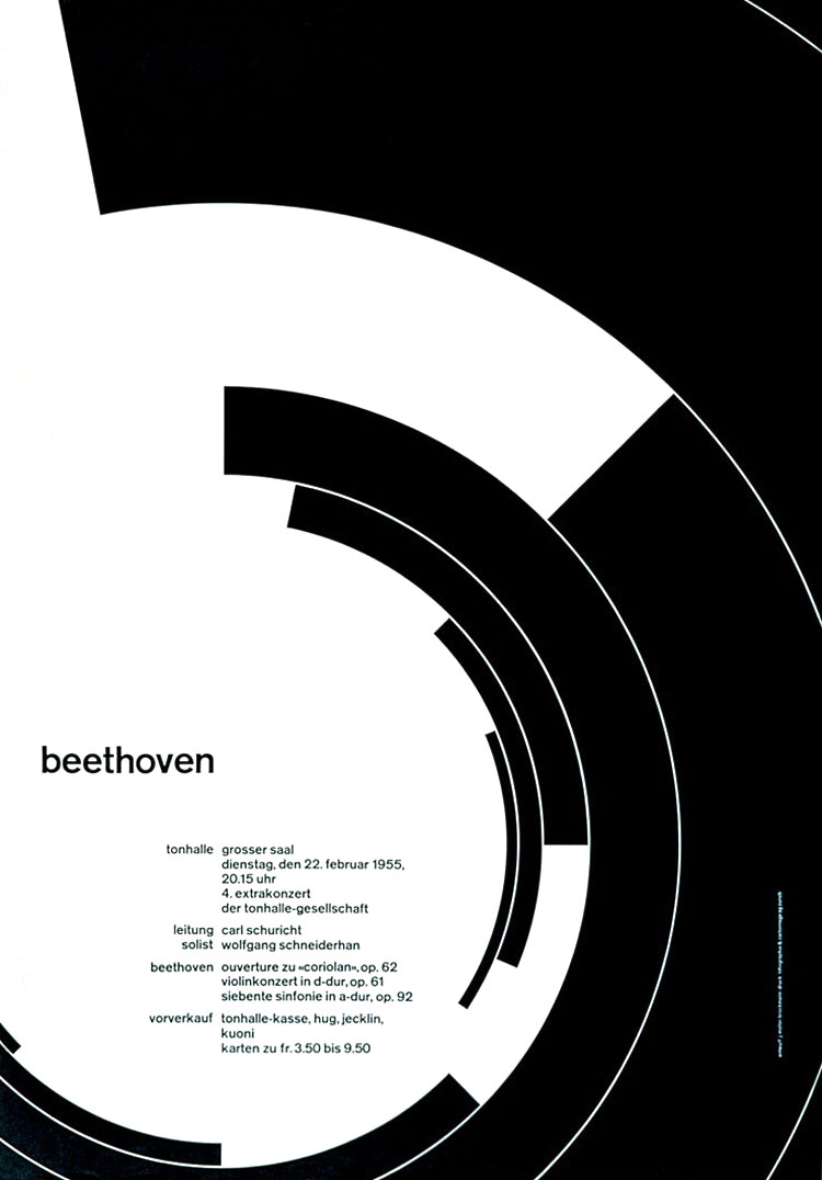
Helvetica appeared very quickly in corporate logos, signage for transportation systems, fine art prints, and myriad other uses world wide. Inclusion of the font in home computer systems such as the Apple Macintosh in 1984 only further cemented its ubiquity. It is a widely used sans serif typeface, and over the years, variants have been released in different weights, widths and sizes, as well as matching designs for a range of non-Latin alphabets.The termination of all strokes on horizontal or vertical lines and unusually tight letter spacing, giving it a dense, compact appearance are all notable features of Helvetica as originally designed. 

Helvetica

David Carson:

Anna also looked briefly at David Carson, an american graphic designer and art director, known for his use of experimental type. The screenshot below shows a range of work on google images created by Carson, all including typography. I researched David Carson again in my own time, I found two posters he designed for the Helvetica film, again, focusing on type with imagery behind. He uses layering techniques, overlapping elements on the poster, including pieces of type to create a distinctive layout with an interesting understand of how all the features work together. I like the idea of using a font like this to be able to interpret a personal design style. 


Seminar activity: Deconstructing Helvetica

This seminar was one of my favourite so far. The session after this mornings lecture, also focused on Helvetica. We used sheets of existing typogaphy, ranging different weights, and opposing colours, to create a new type design. I do believe that David Carson creates a new way of looking at a font, so I was exploring a practice that he had produced. We explored different shapes and letter forms, whether it was using a letter from each style, or using more than one style for one letter, which is what I did throughout putting my type together. I personlised the original word and enjoyed the task, however I did not finish the piece of work. 


Once I was home, I decided to create a few more pieces using the same typeface. I used Illustrator to invite my own interpretation to three pieces, using the same word - hand gloves. I was able to use all the font family, and create contrasts between the black and white features. I used an overlapping technique, all the italic type faces, and adjusted each of the letters to become distinctive and unique.


Thursday 8 December 2016

Motion of Charaters

Below are two animations I created, the top being my first hand in, the second being my finalised piece. In today's After Effects with Sara, our aim was to create a video using the vector character we had made previously in our own time. Unfortunately, I did not save my original character, so during the beginning of the lesson, I recreated the elephant I had chosen to use. The shapes were simple and the colours were not realistic, however the aim of the session was to move the character in a ten second video, so using a detailed illustration would of been too hard for me as a beginner to the programme. 

As you can see in my first attempt, I have placed the character on the right hand side of the animation, and used a block colour for the background as I fell behind due to the recreation of the elephant. I designed the elephant in illustrator, and made sure that parts of the body such as the tail, ears and trunk, were on different layers to the main body - this was so I could move them separately once imported onto my timeline in After Effects. Once imported into the composition on the left side, I dragged them down to the timeline at the bottom, I could then adjust placement, movement, and timing using the tools given. Below is a screenshot of the tools and setting I could use for each part of the elephant. These settings were all new to me so it took me a while to go through each tool and learn how to use each one to the best of its ability. 


Once I had adjusted the movement of a few parts of the elephants body, the session was over and I rendered my animation. The finished product is shown below, a piece I am not so happy with, however in my own time I could improve upon. 


Elephant Animation not finalised from Emily-Beth Phillips on Vimeo.

Below is the finished video that is also uploaded onto Vimeo. As you can see I designed a new background in illustrator, imported the illustration in and placed it behind the elephant in the timeline. I have also included an audio in this animation. I imported the track once downloading it from Free Music Archive, and dragged it into the timeline also. I didn't quite like how the track cut off at the end of the ten seconds. I researched how to add in a 'fade in' and 'fade out', to use for my own video. Below is a screenshot of the audio, as I changed the levels and added key frames for the changes to appear. I am quite happy with my finishing video, as this is the first time I have created a motion attraction and also added an audio using the sound levels for the fading effects.


Elephant Animation from Emily-Beth Phillips on Vimeo.

Rewriting

At the beginning of this mornings seminar with James, we looked into concise writing, writing that is well considered and has precise content. There must always be a clear purpose and direction, and starting the sentence with the subject is always a good start. Explaining one idea at a time, and not using extraneous ideas is also classed as concise writing, as well as using the shortest form of phrases and words. When writing my essay, I must ask the correct questions for the reader, such as why am I writing about the subject I am, who else has had a say on the topic I am looking into etc. 

The main task of today's seminar was focusing on a piece of work we had all brought in. We brought a draft of the first paragraph to our essays, this was to be handed to the person next to us, for them to read through, make suggestions for improvement, and write down what is good and effective in the paragraph. We kept pointers in mind such as: clipped writing, factual, informed, guiding, and referencing. 

I got my piece of writing back with a range of ideas and improvements to make, such as how I could link my writing directly to graphic designers, or where, why, and who are ion the community I was talking about in my paragraph. I also need to back up my work with a quote or where I got the information from. Following the editors guidance, I was to rewrite my sentences, making sure my opening was very strong.

To help with our strong openings, we looked at a few examples:


  • I am always drawn back to the places I have lived, the houses their neighbourhoods. - Truman Capote, Breakfast at Tiffany's (1958)
  • Lolita, light of my life, fire of my lions. - Vladimir Nabokov, Lolita (1955)
  • Someone must have slandered Josef K., for one morning, without having done anything truly wrong, he was arrested. - Franz Kafika, The Trial (1925)
  • Mother died today. - Albert Camus, The Outsider (1942)
All strong, engaging opening sentences that make the reader carry on reading.

Monday 5 December 2016

Order and Chaos

In this lecture we looked into different topics in art and design, comparing order and chaos. Modernism is a belief in objective knowledge. We looked at modernism such as bauhaus and form follows function, we had a quick recap from a lecture a few weeks ago.


Postmodernism:


In the video above, it describes postmodernism as a movement that first came apparent when people thought modernism had failed. Modernists tried to forge a better world with the quote 'Less is more', however postmodernists believed less was a 'bore', and we needed as many references as possible.
 It is quite a vague term, postmodernism, it uses elements of theory. A few weeks ago we looked at the Uncanny valley, this is a postmodern idea, it questions reality. Semiotics has a postmodern angle also - it uses codes of language. Postmodernism uses past styles and past material to collage things into something new. Graphic design comes in with including evidence of mistakes, over printing, etc. Postmodern elements.

The image below uses high and low art, combined into one image, popular culture and also proper art. Different techniques, highly political, and also hand drawn. (Postmodernism)


Postmodernism didn't really have an impact until the 80's. It didn't follow strict rules, no formal vocabularys. People didn't agree with Postmodernism because it gave a bit of freedom. More chaotic, confrontational and irregular than modern art (order). Traditionally in western art, picture making relied on using underlaying rules and structures that are seen as the bases or foundations of the image. 

Vernacular: A style that is associated with or native to a  particular moment, location, group of people. Recognisable as relating to that time, place or group, its zeitgeist (dominant set of ideals beliefs).

The vernacular in Graphic Design: Annette Lenz, 2010


Postmodern -  inspiration, referecing images from the past as history, using bits from the past to make something that is quite new. Deliver a specific message, create unique metaphors, express deeper layers of meaning. Layering of ideas in postmodernism. You have to un pick at different ideas in postmodern art. Its not copying art from the past, its a way of celebrating them. Self reference is a postmodern element. Artist is incorporated into the image.


I picked another example of postern art after the lecture, it is a piece by Andy Warhol, displaying Marilyn Monroe portraits. This piece of work expresses postmodernism in the way it uses a historical piece of art, and replaces it with bold colour and repetition. More than one method of style is used, collage, chance - challenging audiences with a more interesting piece of work.

Thursday 1 December 2016

Casablanca, 1942


Where does the dialogue take us?
What does it reveal?

developing relationships between characters.
creates intrigue to watch more.
not fast, didn't drag, full of content.
black and white film.
laslo was traveling with a lady.
bit of a threat, knows everything about his past. 
Character called Rick. 
There was a fight in Spain.
Renault says I've seen the lady, and looks at rick with raised eye brows. 
Renault, He is romantic.
Ricki, He is a sentimentalist.
Renault, In casablanca he is master of his fate.

Repetition and close reading is good. Opens new paths and new ideas. It makes you look into things differently and questions your ideas behind the clip or piece of work. 

Drawing objects in the studio

The workshop's had rotated back to John's drawing session, and today's task was to draw objects that had been placed at random throughout the studio. These objects ranged from large decorative 3D letters, to bubble wrap and ikea cardboard boxes. I started by focusing on one of the letters from the typographic photo below, I sketched a few other letters but my main drawing from this set was the 'R'. It has small type on is the style of a newspaper and I looked into shadowing, using only a pencil and a fine liner for the main shape. I was sat at an angle from the object so I didn't catch the view from straight on, so the shadowing differentiated. 
The second table I drew at contained large boxes that I mainly focused on. I took parts of type from each box, using colour in my sketches too. I really tried to maintain the style of fonts on parts of the boxes, whether it was sans serif or not. Once I had drawn out a few sections from the boxes I decided to draw the full shape of stacked cardboard boxes. I sketched the shape and angles, making sure each line was as straight and perfect as I could get without using a ruler. I added company logos and also a few shades of shadow with my pencil. I do believe that this drawing went really well using only my vision of the different placements, no guide or ruler. 

This session was different to the previous drawing lessons I have had, rather than drawing our views, I really focused on smaller objects, I think this type of perspective works better for me, rather than drawing on larger scales. 


Monday 28 November 2016

Design and Emotion

Guest lecturer, Tracy Lannon, spoke about emotional engagement and meaningful communication in today's lecture, and how engaging in different types of information will help me create meaningful designs that have a purpose to other people. I need to be able to develop deep self awareness to understand how people function, and I will be able to solve real world problems for a better world to live in with design solutions. 

Throughout the presentation we looked into image illusions and how they effect people differently. Illusions are created with certain angles, patterns, colours and presents an image which the eye cannot understand. We as humans have to filter things down to make sense of happenings. Below are a few images that present illusion, our eyes can deceive us. We make things up from seeing objects.
Our expectations dictate our emotional attachment to things. We look for the same kind of things, preparing us for what we will se next time and what we want to take notice of. For example the first image shows either a white vars, or two faces looking directly at each other. It is known that most people look for the faces first because faces are something we see every single day in life and that is what we are more focused on. 

Size constancy is thought to create illusion, for example the arrowed horizontal lines below are the same size, however we see the bottom line as being longer due the to angles the smaller lines point at on the end of each line. The second image shows a hallway with two people, the left image shows the man sitting further away, and the right image shows the man sitting next to the woman, but using the same sized figure. Distance and is become very illusional.


Visual stimulation:
Everywhere we look there is movement, sound, colour form. Our brains flips the information we are seeing through our eyes. The retina in our eye is made up of two cells, cone cells are on the edge that only see black and white, they help us prepare for nature and help us respond to things we see after adjusting. Rod cells see colour. 


We focused on two tests, the first test we drew a cross and a dot on separate sides of a piece of paper, covered one eye and moved the paper in our vision from side to side - when the dot or cross was out of our vision, the cells in our eyes were not able to work.


Test two, we looked at the circles on the left hand side and picked out the numbers in each shape. It proved quite difficult with all the dots and colours involved, and shows that colour blind people will not be able to work out the figures inside. 


This piece of text is created with words that only have the same first and last letters from the original. It is easy for us to fill in the gaps, there is too much information to process so using the same letters but jumbled up inside, is still easy for us to read as we din't look too much into the words themselves. 


We focus on the things that are more meaningful to us, for example hearing our own name in a conversation. We can't take things at face value, we have to look closely.

Thursday 24 November 2016

Brands and Anti-Brands with Jonathan Linley

Guest Lecturer Jonathan Linley was in this morning, I have met Jonathan before in a previous Monday lecture, however today's subject was focusing on brands and anti-brands. A brand is most simply, a type of product manufactured by a particular company under a particular name. It is a way for a producer/provider to tell us where the said product/service/experience originated. It actually tells us a lot about the brand itself, it is very important to have an identity. 
On the other hand, we looked into 'anti' - meaning opposed to (A person opposed to a particular policy, activity and idea). According to Online Optimism, Anti-branding can be described as a multinational company’s effort to disguise the multinational aspect of their company to appeal to a more of a local crowd. (http://www.onlineoptimism.com/blog/what-is-an-anti-branding-strategy/)

Brands use pre-loaded information, information that's already in our mind to help build a recognisable surface to bounce off. 

New = Nostalgic. A sentimental longing or wistful affection for a period in the past. 
Such as PG tips..
People like drinking the tea, they grew up with the tea in their home, they maybe had a nick name for the tea that only friends are family knew about. Brands develop relationship through narrative - growing up with the identity, having own thoughts on the brand, something might remind you of it.

It is very difficult to know what we can trust, we're very loyal to the product we are familiar with but we need to accept that these are fluid. We are surrounded by lots of info moving at speed, sometimes things go under the radar and brand take advantage. 

Anti-brand was a movement, designers worked to undermine big corporate brands, its nots hard  to see why, as many large conglomerate organisations are exploiting our needs in the name of capitalism, hierarchy and economic growth. We still buy into products, we know consumerism is tearing us apart but we don't care enough to fix it, we all want the new pair of trainers etc., because we believe in the branding more than where the product comes from. 

Jonathan's lecture today was useful to me and I understand how branding works and how companies go about saving money, creating shortcuts and create a large popular base. I also understand anti-branding and how the smaller companies work.

An empty exercise (https://motoreraserhead.wordpress.com/2011/02/22/anti-consumerism/)

Morpholo Tiles


Morpholo tiles were designed by Thieri Foulc in 1985, they are a combination of square tiles which can be arranged in different ways, as a game or a piece of art. There are 240 tiles, containing black and white shapes; the rule of the game is to match the black edges with black, and white edges against white, creating many different combinations. In order to create these tiles, a code in generated using a mathematical formula. Below is an example of one of the combinations.


Generation of the material:
Take a square. Each side may be divided if half, and each half side (or half edge) may be designated black or white. For each side, there are four possible structures: white and white, white and black, black and white or black and black. For the square, with its four sides, there are therefore 256 possible structures. The tiles may be numbered according to the order of their generation:


The workshop today focused on visual games within creative practice, helping us explore Adobe Illustrator and editing typography within chosen fonts. Basic pen tool skills in relation to drawing/rendering and the manipulation of typographic letter forms were also a focus. Communication through art and how artists have re-imaginsed objects to communicate something completely different was our aim this afternoon. The independent learning task was to produce a collection of Morpholo tiles, we created a series of thumbnail drawings of potential tile designs using the code generator. The code generator worked when we chose a number from the given spreadsheet, and entered it online, giving us the tile combination we were to produce. These were made up of black rectangles around the edges or the square tiles. Unfortunately I didn't scan this piece of work to display. 

The next step of today's workshop involved bringing type into our work. We looked into different fonts, online and in the computers font book, and picked a few that we found visually interesting. Picking out small aspects from the letters, we were able to place these into our generated Morpholo tiles, lining up the elements from the type, to match the sides touched by the black rectangles. Before beginning the process digitally, I sketched a few designs on paper that I could then bring into illustrator. 'Water Park was my chosen font, it was contemporary, made up of curved edges and white circles inside the letters. I thought it was interesting and quite detailed, so I took some of the letters, and placed them into illustrator on my square tile document, just how I planned to use them in my sketches. These examples below are my final outcomes, I found it hard to line them up exactly, but in the end I managed to correctly adjust them to touch the right edges. I enjoyed this session as I love working with typography, and I have been able to use illustrator for two years, so I had a great understanding of how to use to pen tool to adjust my lines.


Concept development and Studio Module Criteria

The message of today's session with Rob was evolved around concept development. An image was placed on the board, a red syringe. When you first look, it is a red syringe, however there are other meanings behind the image, and this is what we were working with today. We all gave our personal ideas out, relating to the image on the board. Below are a few connotations for the red syringe:
  • drugs
  • pain
  • medicate
  • illegal
  • addiction
  • fear
  • illness
  • health
  • horror
  • danger
  • infection

We then looked at the same red syringe, but this time 'lifesaver' was printed on the front.
We gave our connotation suggestions again, these were more positive rather than negative like the last few I gathered.
  • help
  • save
  • future
  • health
  • signifier
  • illusion
  • giving
  • change in perception
  • hope 

The idea behind this exercise was to generate a number of ideas that delved deeper into a simple object, we can use this technique in practical work as well as written and theory modules. Thinking outside the box about what something shows helps you to create ideas and leads me to new paths that I can explore and explain. 

The next part of the session including looking into the studio module criteria, below are a few notes I gathered from the slides.

Concept development:
Successful exploration of a problem or theme is demonstrated through the development and documentation of appropriate create concepts and alternatives. 
Looking as multiple concepts - alternatives still need to be appropriate.
Sketchbook - pushing with different themes to look into new places and ideas.
Aesthetics and language:
Creative decisions are made in response to thematic projects and are based on appropriate aesthetic criteria. The ability to discuss these in relation to the work produced and other diverse sources is demonstrated. 
Technical responce:
Appropriate technologies are selected in response to thematic projects. The ability to discuss these in relation to the production of the work is demonstrated. 
Integration and Synthesis:
Awareness of the needs to reconcile conceptual/critical issues with the contexts of genre and audience (graphic design, animation) is demonstrated. 

Monday 21 November 2016

Semiotic Analysis in Advertising

In the seminar following toady's lecture on semiotics, we looked into a few christmas adverts that had meanings behind just advertising the brand and its increasing trade. We spoke in groups about how each advert shown, had different types of music, emotions, characters, scenes, etc. This relates to semiotics as the signs that are given out whilst watching the adverts are deeper and more interesting than just a supermarkets christmas advert. 

The christmas adverts we were given:

  • Goggle box - advertising for goggle box by watching the christmas advert, using format of one to advertise another (Product orientated)
  • M&S - Animated man giving out everything he could to please others
  • John Lewis - Boxer dog on trampoline enjoying daughters present
  • Sainsburys - Preventing war at christmas, opposing sides play football and get along until back to reality
  • John Lewis - Man on the moon, giving gifts to people without family 

Semiotics I focused on:
Each advert constructs values
Sentimental
Songs that I listened to - family, sharing, dreaming, flying away. 
Sense of family
Put aside conflicts, come together.     
Sound becomes reference point for reality. (Sainsburys advert)

Meaning and Message - Semiotics

Semiotics are the theories which explore:
- How systems of signs work to make meaning
- How we represent ideas and create meanings using a range of tools such as words and images

Why do we need to know?
It is fundamental to and understanding of:
-How words and images - together with ideas, are used to make sense of the world
-How visual communications work. They can help with my assignments, and also my practical work

'All good designers are semioticians' - Anna

As both creators and consumers of visual art and design - and as participants in a culture which functions on the basis of shared meanings and common understanding - we decode meaning from signs and symbols with ease. Below is the semiotic iceberg that was shown in my lecture, it represents how we see signs, but also shows what is really behind the visual evidence, represented by the waterline covering the rest of the iceberg.

Semiotic IceBerg: http://english1312section078fall2012.pbworks.com/w/page/59782542/Semiotic%20Iceberg%20Exercise

The signs we see and interpret can range, from images and pictures, to objects and sounds, gestures and symbols and also codes. These signs can have different impacts whether it is emotional or anxious etc. They can mean different things to different people depending on individual experiences, cultural differences and context. Semiotics show how we make sense of the world through words, experience and interpretations. Our brains are wired to make sense of an sign in milliseconds. Our actions and thoughts - the things we do automatically - are often governed by a complex set of cultural messages and conventions, and dependant upon our ability to interrupt them instantly. The commercial world takes full advantage of our ability (big brands/super markets). 
Through habit and practice we learn language and different words.

Phonemes, example: Each of which we have learned to connect to a certain sound, which, when placed together, make a word which signifies 'cat', the animal, along with all related ideas of cat-ness. Nothing about the 'c' 'a' or the 't' or about the whole word 'cat' have any inherit 'catness' about them, however. Associating this word with the mental image of a cat is learned behaviour.

Colour semiotics:
The ways in which colours express certain codes, information that make the viewer understand a specific message or feel a certain emotions. This is culturally continued. It becomes habitual.  

Ferdinand de Saussure, Course in Genral Linguistics (1906)
'In itself, thought is like a swirling cloud, where no shape is intrinsically determine. No ideas are established in advance and nothing is distinct, before the introduction of the linguistic structure.'

Key vocab:
Inheret - existing as an innate or essential constituent of characteristic. 

Codes and conventions:
Technological - camera angle, framing
Verbal - spoken or written
Symbolic - decoded on a conotational level


Anthony Burril:
The layout, colour, text (without semiotics)
(with semiotics) screen print, made with oil and water. 

Image found at: http://www.2amfilms.co.uk/creative-review-anthony-burrill-oil-water-do-not-mix/


Visual onamatopeia?
Word signififes its meaning

'Relay: The words and images tell a story equally. They stand in a complementary relationship. The text and image tell the story equally, where text supplies meanings not found in the images alone.'

Thursday 17 November 2016

Creating a Film Trailer using After Effects

During today's Process and Production session, I had Sara, developing my skills in After Effects, a programme I was introduced recently. A recent animation I put together using this software, included changing coloured slides to beats in the audio I downloaded. However this session involved me creating a short, 10 second book trailer of my choice. I already had pre-made slides to take to this session, as I had decided on a book I wanted to use earlier in the week. 

The name of the book I wanted to turn into a short trailer clip was Girl on the Train. I recently saw this at the cinema and knew its tones and emotions well and clear - helping me put the trailer together. To begin with I set up an inDesign document using the correct dimensions, and took a picture that I had recently photographed to use as a background image throughout my animation. I adjusted the image so that it was a dark, gloomy grey scale setting, and also image traced the photograph to a high fidelity setting - this made the photograph more geometric rather than realistic. Once the image was adjusted, I used different sections of it for every slide, and on the 10th slide, it presented the whole image. I have screenshot a few examples of my slide background and placed them on the left. 

I created a slide for each second, with quotes, phrases, authors name etc on each one. I used a light colour for the text to contrast against the darker imagery, and the font was a light weight typeface, used in both lower case and upper case, as seen in my Vimeo link below.

I came across a slight problem after adding all ten slides into my animation to play them back. I noticed that having a slide a second was much too fast for the audience to keep up with - some slides had two lines of text included. It was visibly difficult to read when the slides were changing so quickly, so I adjusted the amount of slides I used. I also deleted text and shortened my phrases for a more sharp, snappier effect. I now have seven slides over a 10 second time period, and I have added one fading motion in to a slide half way through. 

Film Trailer - Gone Girl from Emily-Beth Phillips on Vimeo.

I think my background image works well, and the text is suitable for the imagery - subtle so it does not over power in front of the edited photograph. I think if I had more time to decide and look into, I would change the audio I have picked, there were no beats to the piece, so it was difficult for me to decide when the slides were changing and how long I should give them all. However I am happy with my first proper motion graphics animated video.

Multiple Perspectives - Demonstrations of Differences

This morning's seminar followed on with ways in which to help build the best assingment I can achieve. The topic today was perspectives, and how looking at things from different angles can build a whole new world. The exercises and speeches we were given in this seminar helped me realise that whilst writing my assignment, there will always be more ways to look at different pieces of information I will be jotting down. There is never one straight route that I have to follow, there is always other directions I can lead and new ways of thinking will become apparent.
Nothing is unchanging, internal or timeless. Therefore, there is no absolute 'eternal truth'.
No absolute politics, life, ethics, morality, truth, goodness.

We watched the Shimmer suit video online, it represented new dynamics, and how we are always looking at something different that is constantly changing.


Another video we watched to represent multiple persperctives was the points of view video found on youtube. It shows how we change our understanding depending how which angle we look at something, and we never know the full truth, there is always more to be found. There is no whole picture to get, there is always too much going on. 


To round the seminar up, we took part in two exercise with the rest of the class. One, we watched a video up to around a minute and a half long, then got split into four groups. Each group had 20 seconds of the video to focus on, to share in their own words their understanding of the scene. We all had different views on what happened at different parts of the video. So depending on which part you were focusing on, it had a completely different storyline.

The final exercise included looking at different sides of a box form different angles, my side displayed a piece of paper with a man walking away. Other sides had different objects attached, we looked into angles, reactions, and perspectives from all different people.

Monday 14 November 2016

Type

Type is the physical embodiment of a collection of letters, numbers, symbols. Anna went through a number of examples today, displaying different types of typography and typefaces, explaining how they range, sometimes due to the date of creation. First of all, we looked into Jan Tschihold, The New Typography, (1928). This was a handbook that started a movement, it was really influential towards modern designers. It rejected the normal way of using columns and other types of layout; before this book, type was not that significant. It was an accessible handbook that was not too academically demonstrated. It influenced other books, magazines, brochures etc.

Personal Research: 
Further research into The New Typography book, helped me find that Jan Tschihold took his lead from currents at the Weimar Bauhaus, he then codified the movement with accessible guidelines is his book. Almost over night, typographers and printers adapted this way of working, from business cards and brochures to magazines and advertisements. 

Image found at (https://www.amazon.co.uk/New-Typography-Weimar-Now-Criticism/dp/0520250125)


This book was organised around the following principles:
  • Asymmetric balance of elements
  • Utilisation of white space
  • Sans serif typography
  • Advocated lower case letters
  • Supported the typo-photo approach
  • Content was designed by hierarchy
After looking into Tschichold's handbook for modernised layouts and typography, Anna went on to talk about 'Fameux sans serif' from the bauhaus: created by Herbert bayer, universal, 1925.
This was a type of font that was simple for a machine layout, cheap to produce, easy to read and legible. It did not use capitals, and it stood alone as a universal typeface.


Image found at: http://www.designhistory.org
/Avant_Garde_pages/BauhausType.html


I have looked at Theo H. Ballmer, 1928 - he was a Swiss graphic designer that produced a clean and clarity typeface just like the example above. Neues Bauen is a hand done typeface that was presenting in an exhibition. It contains only capitalised letters for a bold, legible style, perfect for creating posters with, just like my example below. 


Image found at: http://www.eyemagazine.com/feature/article/swiss-radica

Joseph Muller- Brockman, produced a clear sans serif typeface,  it is blocky, and he utilises lines. It is very apolitical, with no baggage. He uses abstraction in his work. Brockman was also influenced by the Bauhaus movement, and he is one of the most well known Swiss Designers. This poster below for the Zurich town hall is probably his most recognised piece of work.  


MÜLLER-BROCKMANN Found at: http://www.designishistory.com/1940/joseph-mueller-brockmann/

I looked at kinetic type:
Kinetic type is an animation technique, it mixes motion and text together to express ideas through a video. The text presented in the animation video conveys a particular idea or emotion. 
  • Words appear in an order
  • TV adverst, blogs, landing pages
  • From paper to screen
Personal Research:

Saul Bass, worked with hollywood film makers. He made a title sequence for the man with the golden arm. In Bass’ own words: 


“My initial thoughts about what a title can do was to set mood and the prime underlying core of the film’s story, to express the story in some metaphorical way. I saw the title as a way of conditioning the audience, so that when the film actually began, viewers would already have an emotional resonance with it.”

It is a very creative way to present pieces of text, is becomes memorable and the music used ties in with the motions, creating a recognisable piece of music also. 

Seminar and Personal Work:


The seminar following on from the Type lecture, focused on a Stencil typeface, created by Joseph Albers in 1926. Albers wanted a style that was very simplistic and easy to read, a very legible typeface, so he produced a stencil for the alphabet, using only 10 simple shapes. We were given the task of displaying examples of the letters, I have put together my results (shown above). Most letters were easy to produce and put together, however others did not work quite as well, proving difficult to use with the modern day alphabet. Although it was proven difficult in some cases, this stencil design is very stylish and does present a very contemporary typeface. 

Albers taught at the Dessau Bauhaus, there he designed a series of stencil faces. Before his teaching years, he was a student at the Weimar Bauhaus. 


 The typeface I looked into in the seminar is based on a limited palette of geometric forms combined in a size ratio of 1:3. Drawn on a grid, the elements of square, triangle, and circle combine to form letters with an economy of form. His idea was never intended for text, he wanted the face to be used on posters and in large scale signs. I can understand why this text wouldn't work on a smaller scale, used as body text perhaps. The shapes in the typeface and very precise and work better when enlarged.