Before my After Effects workshop with Sara this afternoon, I made sure that I had completed the homework that was set for the start of this session. My task for the session was to produce a ten second animation, presenting a font of my choice, and any information/description I had gathered to put into my slides. So my homework to bring to this class, was to plan and put together the slides I would be using. In the last workshop, we watched a few examples of videos, based on typography; the slides weren't full of text, they presented a nice flow of boards using effects, fonts, and shapes/illustrations.
From past animations I have created, I have realised that using ten slides for a ten second animation doesn't work well when the slides include text. The audience would struggle to read each slide, given one second each. Therefore, I designed seven slides that I have then put together for a ten second duration.
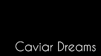
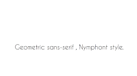
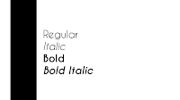
I chose a font that I had previously used in one of my college projects, Caviar Dreams. This font is a sans serif style, very contemporary and geometric. (I prefer modernised fonts to classic, serif fonts.) The colours I chose to use throughout this animation were very basic and simplistic, black and white. Too much colour and background imagery can take away from the creation of the font and the importance of the style the font presents. So to start, the first two slides would hold the name of the font, and show the audience the style the font uses. I placed this in the bottom right corner and left the negative space so the focus was on the name only. The colours would then switch to a black background with white text, and I chose an effect on the programme to switch slides in the best form, that I will show further on in the post. The third and fourth slide, present a short sentence, explaining what type of style Caviar Dreams is. Moving on to the fifth and sixth, I have presented the different weights and styles the font family holds, including regular, italic, and a bold in both. The final slide includes the creator of the font, with the same black panel down the left side. I saved my slides, so I could then start to put together the animation. Below are small screenshots of the layouts.


Sara refreshed our memories using After Effects, as the last workshop finished before christmas. We went through as a class, how to import objects and audio, and also going through the basics of how to use or adjust different effects, such as opacity, rotation, scaling, and positioning (creating a movement of an object or text). I used a few of these effects throughout my animation. Starting with the first slide, I used the positioning effect, found in the transform section on the text layer, and used the key frames to create an effect that made the text flow in from the side. This was a basic effect on the timeline, that helped start my animation off nicely. The screenshot below shows the timeline and the keyframes that I have placed, creating the movement from off the slide, to the right hand side.
The change between the first and second slide is shown with a fading in effect. I used this effect so that the colours would gradually switch to look very effective. I have used the solid black background colour on a new layer, and duplicated the text, changing the colour to from black to white. I started the fade in of these two elements at the two second mark (using the opacity setting in the drop down 'transform' setting), enough time for the first slide to make an appearance. The first slides layers, were cut down to two and a half seconds using command ], so they would disappear for the rest of the slide (layer 11 and 12). These stages I have shown in the next screenshots.
From slide two to three, I added an animation that shattered the black solid background, into the white background I added to start just before the three second mark. This white background colour also had a fade in effect on it using the opacity setting; making the brightness of the white get more intense as the black background disappeared. As well as this effect I found on the programme, I used the position, space and rotation setting on the white text on slide two. I used these and adjusted the settings so that the piece of text got larger and rotated round and off the page, in time for the next stage to start. Below is a screenshot of the setting I adjusted the text layer to.
Throughout this animation, I adjusted small settings and added effects to make small corrections for the video to flow at its best. The next stage was the sentence, half of which I had timed to appear with the white background. I started the second section of the sentence at four seconds, while the first section appeared at three seconds. I added a text transition called 'typewriter' to this part of the sentence, creating a professional, animated look to my video. I shortened the keyframes so the typewriter would increase the speed, leaving the full sentence on display for half a second once it was all typed. This also has a fade out effect and I cut the layers down at 5.5 seconds for the next slide (leaving the white solid background to run until the end).
The last three slides all had the black panel, which I adjusted slightly, adding a small white line down the left side, just for more decoration. These elements had the 'Stretch Master Control' effect added, making them slide in from the middle of the screen. The styles then transitioned from the top, sliding down to where I wanted the text to be placed, making sure they started there transition once the black column had finished its transformation. These effects were all found in folders through the 'Apply Animation Presents' setting. Remembering to cut the layers down, I adjusted the timing of each keyframe using the drop downs on the left hand side of the timeline - making sure the timing of each slide fitted perfectly and was legible/clear.
The last slide was fitted at just over 8.5 seconds. This was the creator of the font, and I used a text animation, flipping each letter one by one, adjusting the time of the animation so it ended before the ten seconds was over (making sure the full line of text was readable).
I am really happy with my final outcome, you can play the link just below. I was given a task of producing a typography based film, following basic procedures, however the effects, adjustments, timing etc, I put together personally, and I believe I created an animation that portrays my new skills and techniques I have gained since working with Adobe After Effects.
Caviar Dreams from Emily-Beth Phillips on Vimeo.


