Thursday, 30 March 2017

Year One Finale - Collaborative Film

My final After Effects workshop was held today, with Sara producing another animation. For the final session, we were to create a ten second film, using an object that would fly through the sky, from the right side to the left. At the end of designing our object and adding effects to our personal animations, we collected each students video, and produced one final, four minute movie that included every students flying object/animal. 

I brought my flying object to the lesson with me, I created it using Illustrator, and produced a butterfly. Starting out, I traced the shape of an existing photograph, then added colour, and a lot of detail to the wings. As you can see, the patterns inside the wings are soft - I created a feather look, using an inner glow on each segment, as well as the smaller circles around the edges. The colours are warm tones of orange and yellow, not too bright for the black body of the butterfly. I was happy to use this in my animation, it also faced the left side, which is the direction it should be flying once I set up my animation. 


To start the video process, I set up a workspace in After Effects, and coloured the background in a dark blue. This blue was a default colour for us to use, it would be used throughout the whole finale film so the background for every students flying object would stay the same throughout the three minute movie. Once this was set, I imported my butterfly, making sure each layer that I wanted to move separately, was clearly labelled. I had the body, the left wing, right wing, and anteneyes all on different layers, ready for me to start adding effects. For an object to move across the screen, throughout the ten seconds, the positioning, anchor points, scale, and rotation settings could all be changed. I had a problem with trying the move my wings correctly, I then realised my butterfly had a 3D look rather than just a flat shape, so I changed each of the wings to 3D, giving me other options and ways to rotate my layers. I have shown the X, Y and Z rotation options below - I then used my own knowledge and practice to work out which of the options I needed to adjust to make my wings flutter in the right direction, on the right angle. I have the timeline for one of my wings open below. Key frames have been placed throughout the ten seconds for each of the rotation settings, at a speed I thought worked well. 


As well as submitting the movement of the wings, I needed it to fly across the screen, which was a original given task. I created I null object to attach my butterfly to, I then used anchor points to move my butterfly with from one side to the other, setting one key frame at the beginning and one at the end. As well as seeing the butterfly fly in a curved movement (using the anchor bars along the movement line) I wanted it to get smaller as it got closer to the left side. This gave the effect of the butterfly flying into a distance, as it was facing towards a distance anyway which made it easier. So to make this work, I changed the scale of the whole butterfly, slowly decreasing the size as it got to the ten second mark. 

I was finished before the end of the lesson, so to improve my animation, I produced a rotation for the full butterfly. This gave a swooping effect and added more movement that equals to a realistic butterfly. I also duplicated my butterfly so I have two, however I changed the movement of the second butterfly, creating a separate curve on the null object, and started it a few seconds after, so they both flew in at different times. 

I have added a lot of my own techniques into this animation and I am very pleased with the overall 3D looking outcome. I rendered this movie to add onto my Vimeo site, the animation is shown below. I have also linked the full film that my group put together. 


Butterflies from Emily-Beth Phillips on Vimeo.
Group B Finale - 16:40 from Motion-go on Vimeo.

Monday, 27 March 2017

Telling Tales: Iconography and Authenticity

Iconography is from the Greek words for 'Image' and 'to write'. It is the identification and description of the content of images, the study of symbols depicted in a work or art or design. Traditionally, these symbols derive from a readily recognisable, common currency of cultural experience.

WJT Mitchell, Art historian: 'Iconography is about the rhetoric of images’, that is, it helps us to know ’what images say and what to say about images’.

All the symbols below have a meaning, they all determine peace.
Figurative image of dove: Depicts something in the real world, instantly recognisable as opposed to abstract.
Peace symbol: colourful, abstracted.
White flag: Relies on colour to show a message. Shows peace. 


Peter burke, Historian: Images 'speak', they are 'designed to communicate'. 'To interpret the message it is necessary to be familiar with the cultural codes'. We all share an understanding of context.

Richard Howells, Visual Culture, 2003: 'Paintings have meanings that the artist would expect the viewer to understand. Successful communication of these meanings, however, depends upon shared cultural conventions between painter and viewer’.

Byzantine Portraiture:

We can trace iconography through history. It is an example of early christian portraiture. Symbols within the painting depicted an idea. It is no longer about representing reality, it was an idea through symbols, making connections through earthy material, creating religious symbols. The lamb round his neck, presents a man that is maybe a shepherd. He is possibly Jesus, who was seen as a metaphor of a good shepherd - using our knowledge of the context. 


Iconology:
  • The study of meaning contained within these iconographic symbols; i.e. the interpretation of the content of images.
  • The branch of art history that addresses the description, analysis and interpretation of images.
  • Iconology looks at more than the face value of the symbol, taking into account its context - both historical and cultural, as well as in relation to the artist or designer's broader oeuvre of work.
Importance of 'historical and theoretical context' - Erwin Panofsky - iconologist - Studies in Iconology (1939).Using visual evidence to 'unlock' meaning.Looking as opposed to just seeing. 

Take a painting for example: 
  • The first stage of analysis: What do we see at face value? What genre is it? What is it a painting of? Is there any text?
  • Second stage of analysis: What do we see when we read between the lines? What else can we say about it? What details are evident?
  • The effective communication of meanings through visual devices requires shared cultural conventiuons between viewer and reader and an understanding of context (the circumstances that form the setting for an event, statement, or idea, and in terms of which it can be fully understood). 
Van Gogh, The card players

It is a painting, we can start to develop a recognised abstract idea, using light and colour, not super realistic. There are people sat at a table. We can read the title to make an assumption of what the men are doing. We don't know their relationship, where they are, who's winning the game. There are lots of other questions. 


Metaphor - A type of analogy where meaning is derived through association, comparison or resemblane. It equates two things in order to make an impact. For example, this image is a sense that they are trying to sell us a tough and strong car. The rhino is where the motor would be. It triggers ideas and is an example of a visual metaphor.


Here are two images. One presents an apple growing into a tree, with text. It displays a seed of an idea growing into creativity. We are left to interpret the other image without text. We can make decisions about what the image means. It is a pair of glasses on there side, and also an egg timer. Associations around time, patience, maybe time running out - a sense of emergency. Then the glasses depict intelligence, saying something about patience being the companion of wisdom. 


Symphony in Slang from Lee Presson on Vimeo.

Symphony in Slang by Tex Avery. 1951
Quite old, but it is interesting, he uses an idea of a metaphor and makes it come first. Metaphor is all of the meaning, he's inverted the way of using a metaphor. 

Marcel Duchamp, The Creative Act, 1957

‘All in all, the Creative Act is not performed by the artist alone; the spectator brings the work in contact with the external world by deciphering and interpreting its inner qualifications.’ 
The audience is just as crucial, it is about the visuals understanding. 

Desperate housewives title sequences - introduces famous works of art, all works that have iconographic meaning. Hidden meanings, to how we interpret the characters in desperate housewives.


The Arnolfini Wedding Portrait, Jan Van, Eyck 1434 

Decode the image, ask questions, every element has a story to tell in this image. I wonder whether the woman is pregnant. I also notice clothes they are wearing, striking background imagery, in a bedroom. Understanding the context of the work that was made around this time. Is it actually a wedding portrait? It may be a portrait about death. This has intrigued people for years. It has a mirror in the back that reflects the room, it opposes questions about where the artist stands, as he isn't in the mirror. Plays around with different perspective ideas. Taking a glance at the painting, we don't notice as many elements as we could if we looked deep into the painting.


Hans Holbein, The Ambassadors, 1533 

Crucial for iconography. There are lots of symbolic elements, we can make a iconography reading. There is a splodge in the foreground, it is a detailed double portrait but we can also see a distorted skull. There are religious and scientific symbols.  The anamorphic skull as restored in 1998. It is distorted to the viewer. It does communicate a message but in a hidden way. ultimately everything does turn to dust, it interprets death.


Erwin Panofsky's three levels, or 'strata' of iconological meaning:

  • Primary - see colour, shape, read text etc.
  • Conventional - Relies on common understanding and shared knowledge.
  • Intrinsic - What does it all mean? start to make assumptions, right or wrong. For example the image, the man might want to be known as polite, lifting his hat off as a good gesture. 

Authentic - Some synonyms and antonyms:
  • Unique 
  • Common
  • Copy
  • True 
  • False
  • Real
  • Imitation 
  • Genuine 
  • Counterfeit 
  • Original
What does it mean to be authentic?

For many, the search for the authentic provides a powerful source of meaning in a secular age, allowing a person a unique personal identity in a world that seems alienating and conformist. This demand for authenticity — the honest or the real — is one of the most powerful movements in contemporary life, influencing our moral outlook, political views, and consumer behaviour. 

'Craftsmanship names an enduring, basic human impulse, the desire to do a job well for its own sake.’ - Richard Sennett 

In seeking to make objects which avoided the appearance of fine art, the Minimalists attempted to remove the appearance of composition from their work. To that end, they tried to expunge all signs of the artist’s guiding hand or thought processes – all aesthetic decisions – from the fabrication of the object. For Donald Judd, this was part of Minimalism’s attack on the tradition of ‘relational composition’ in European art, one which he saw as an out-moded rationalism. Rather than the parts of an artwork being carefully, hierarchically ordered and balanced, he said they should be ‘just one thing after another’. 

The idea of removing them from the though processes, creating a distance and how that might effect how authentic something might be. 

Iconology

After the lecture looking into iconography, we looked into the idea of choosing one of the following words, then exploring the authenticity of it. 
  • Real
  • True
  • Copy
  • Imagination
  • Original 
  • False
We had to reflect our ideas of authentic visual communication to reinforce the meaning of our chosen word. My group chose the use copy. we used the different fonts and created the word with every font, then reflected the word in our own coloured font. It was a quick, simple task, however our piece of work really reinforced the word with the method and style we used.


Thursday, 23 March 2017

Conclusions

A conclusion holds a number of points, it can sum up the piece of writing/essay, it can also refuse to sum up - creating more of an argument and point of view. It can change the subject, leave the reader satisfied or it can leave them wanting more. The ending of the writing can also put everything into perspective, however it is possible to explode the perspective and open the mind of the reader.

“First sentences, as we have seen, are promissory notes. Whether they foreshadow plot, sketch in character, establish mood, or jump-start arguments, the road ahead of them stretches invitingly and all things are, at least for the moment, possible. Last sentences are more constrained in their possibilities. They can sum up, refuse to sum up, change the subject, leave you satisfied, leave you wanting more, put everything into perspective, or explode perspectives. They do have one advantage: they become the heirs of the interest that is generated by everything that precedes them; they don’t have to start the engine; all they have to do is shut it down” (Fish, 2005, p. 119). 

After looking at points that we can use inside our conclusions, we thought personally at 'What have been the limitations of our study and what further work/research is needed'. I believe that I should write more about how I regard the relationship between graphic design as graffiti, and reference other new opinions on the subject. I would also like to use more images to illustrate my ideas about how subcultures often feed into or even become subsumed by dominant cultures.

My second essay submission should be full of new ideas, I shouldn't write about the same subjects as before, repeating myself or expanding to create longer sentences. I should have a new conclusion all together, bringing new points from my essay into the ending to conclude. I need to show my curiosity and interest for the essay I have written.
'Future research may reiterate the points made here. Introducing existential thought may provoke an interesting regurgitation of the absurd and the anxious in the context of design. Providing a more detailed history would have bolstered my argument more, as would an in depth understanding of phenomenology.'

Our task for the future for writing our essays was to ask questions, for peer and tutor advice. I should write my essay and maybe read other students essay for other good examples. We can edit each others in our own time and each Thursday morning in these seminars. 

Monday, 20 March 2017

Postmodernism and Appropriation: Part two, Memes Seminar

A meme is taking an image and applying a caption, something funny, sometimes unrelated. It is free and open art. It is quite a complex art form, to create a meme that is not offensive in anyway way towards any stereotype. 

Our first task was to produce a Donald Trump Meme: We were given an architect brief, it had a number of facts on that we could then use to help us create a meme. The basic fact being, he has plans to build the controversial wall along the country's border with Mexico, with a deadline for prototype proposals set for early next month. 


We needed to produce and apply a witty, relevant, engaging statement to create a meme. I looked online to help give me a few ideas as to where to start and how a meme creates a funny profile. There were a lot of Trump memes online! Such as:


My Donald Trump meme: 'I suck my own finger because Melania won't. 'Get that Mexican OUT.'  


Our next meme task was to create a meme based on Nicola Sturgeon. The subject was the Scottish independence and how Nicola Sturgeon was willing to discuss vote delay. 'First minister suggests she would consider putting off referendum by a 'reasonable' amount of time but not until after Brexit'.

Postmodernism and appropriation: Part two

Previous lectures covered: 
  • Representation and reality
  • Kitsh
  • The Vernacular
  • Self reference
  • Deconstruction

Today we were bringing these ideas together to think about
Examples of parody, pastiche, satire in visual design as a way of achieving:

  • Humour
  • Political commentary
  • Critique
  • Layered understanding/engagement
  • Nostalgia

    We also be explored and asked questions around the idea of authenticity. 

    Appropriation: The intentional borrowing, copying, and alteration of pre existing images and objects. It is a strategy that has been used by artists for millennia, but took on new significance in mid 20th century America and Britain with the rise pf consumerism and the proliferation of popular images through mass media outlets from magazines to television. 

    'The goal of communication is to induce in the audience  some belief about the past, present and future.'  - Richard Buchanan, Declaration by Design (1985) 

    'Design has always borrowed images from other fields, especially from art and popular culture
    - Rick Poynor 

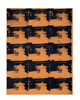
    Andy Warhol, Orange Disaster number 5, 1963 


    Electric chair, final executions happened. 
    Metaphor for death, through repetition. Reduces it to meaningless. 
    Waiting for its next victim. 
    Doesn't have an effect seeing a gruesome picture over and over again. 

    Repetition is used through art and design, I need to think about how it works as a visual device. 


    The white stripes - Hardest Button to Button


    Uses repetition throughout music video, plays on a similar idea to andy Warhol.
    Described as making living people into puppets. Removing humanity from the musicians. 

    'Vintage' - Appropriated nostalgia -Images
    Period, place or a style. 

    'The museum relies heavily on the promotion of selective memory or nostalgia.' - Kevin Walsh
    One persons view point, one person is responsible for the information, relies on a personal opinion. 

    'We look at the present through a rear view mirror, we march backwards into the future.' Marshall.


    Marcel Duchamp, 1919. Ready made, Mona Lisa. LHOOQ. 

    Readymade - A commonplace refabricated object isolated from its functional context and elevated to the status of art by the mere act of an artist's selection. So revered. Religious icon. 

    Assisted readymade - where slight inverenations have been made to such an object. Challenging conventions.

    Banksy: Moona Lisa


    Sherrie Levine, Fountain (after marcel champ: A.P), 1991 

    Inverting, crafted using expensive materials. showing artist innovations, continue to build on achievements of the past. 

    Sherrie Levine: 'I try to make art which celebrates doubt and uncertainty. Which provokes answers but doesn't give them. Which withholds absolute meaning by incorporating parasite meanings. Which suspends meaning while perpetually dispatching you towards interpretation, urging you beyond dogmatism, beyond doctrine, beyond ideology, beyond authority.'


    Other postmodernism and appropriation art pieces:

    • Banksy: Show me the monet, 2005. Subtle twist. Abandoned shopping trolley. 
    • Paula Sher, Swatch, 1985, Herbert Matter, 1935 
    • Barney Bubbles, Music for pleasure, 1977, Album cover.
    • Piet Mondrian (De Stijl) (Style in dutch) Movements in history of visual design. 

    Pastiche, parody and satire

    Sature - A critique or attack, driven by a desire to make a social commentary or to challenge the status quo but which employs humour as its weapon to do this.  Makes people smile, but also makes people think.


    Pastiche - A form of ‘homage’. Like a parody, it copies or mimics elements of another work's style, sometimes in a humorous way, but usually just as an affectionate nod to another artist's work. It references the original without necessarily making a comment (positive or negative) about it. 


    Cartoon:
    • 1670s, ‘a drawing on strong paper (used as a model for another work)’, from French carton, and from Italian cartone - ’strong, heavy paper, pasteboard,’ thus ‘preliminary sketches made by artists on such paper’.
    • Extension to comical drawings in newspapers and magazines is 1843: ‘Punch has the benevolence to announce, that in an early number of his ensuing Volume he will astonish the Parliamentary Committee by the publication of several exquisite designs, to be called Punch's Cartoons!’ 
    Appropriation can be so layered, re-appropriation enhance the impact of original image.
    Jeff Rankin after Shephard Fairy, and re-appropriated version, 2008-17 is an example of re-appropriation. Copycats can create powerful art.

    Thursday, 16 March 2017

    Cinema 4D Introduction

    Stephen was holding my afternoon Creative Suit workshop today, he introduced a new programme to me, Maxon Cinema4D. Cinema4D lies at the intersection between 2D and 3D digital asset generation, and its industry leading toolset allows for the production of high-fidelity static and motion based work. Its capability can be applied to almost any creative brief and its rendered output options reach across the entire spectrum of digital media - from posters to packaging, and from movie effects to full 3D animation and even VR. The basis of the workshop, included going over the various palettes and manager panels before going trough a number of small experiments aimed at familiarising me with a 3D computer graphic workflow. At the end of the workshop, I had an outcome that displayed a 3D logo in Cinema4D, by extruding a vector and adding a material. I also had a few pieces to share from the experimental tasks as well. 


    Tools and features that I looked at including exploring the workspace, adding objects for static renders, applying deformers and monograph objects, and working with splines and NURBS. I also utilised light and shadow, as well as adding colour, texture and simulated materials to objects. I rendered for both still images and animation, and added additional cameras to my work to add numerous points of view. I will go through these steps in details below, to show my understanding of the programme.


    I was given the screenshot above before I opened up the Cinema4D programme. This analysis gave me an idea on how the software is played out, and what setting and tools I will most likely be using today. This included the Menu, command groups, object manager, data entry fields, coordinator manager, animation toolbar, material manager, 3D view, and command palettes. As a starter lesson, remembering all these features was extremely hard, but it was just an introduction, I will most likely be using this software properly in my second year - increasing my knowledge even more. 

    Opening the programme, I set my layout to startup, it should automatically be on this setting anyway, but if not, for future reference, I will be using this layout. To be able to use the tools and features, I needed to create a box in my workspace, this cube could then be changed and adjusted using the toolbars around the edge. I selected the box button, and it drew out a box in the middle of my view. 


    With this box, I could change the scale, placement, length, etc using the buttons on the top tool bar. These could be used with any given shape or object. There are also shortcuts on the keyboard that I can use instead, once I understand where everything else is inside the programme. Below are screenshots of the tools, as well as different sized boxes, also using the handle bars inside the shape itself. 


    I could change how many segments I wanted inside the cube. For each face, I could split the length into smaller squares, this would be used for measuring the side of a shape. 


    I opened up a file that Stephen had saved for us - it was a set up of creams and a box. These were all 3D looking, and I was to render these objects so that they could save and look good on a professionally set up background, rather than sat in the original 3D editing view. I saved it as a still image to be able to render it correctly. There were no moving, animated elements. 


    After learning the effects of rendering, we opened a number of other Cinema 4D documents. This was key, to be able to find our way around many other sections of the programme. We could dig into layers of art work, using extreme amounts of detail to create one final outcome. We also looked at a piece of work that gave us different perspectives and views inside one piece of work, using many different cameras. I have screenshots below of the work I opened - showing an insight of many angles. 


    The next stage involved our own interpretation. We opened an animated piece of work, leaving us to edit the rotating object. I could add rectangular bricks inside the rotation, I could change the angle of the shadow, and I could also change the speed the rotation kept to. I did this by using the setting in the bottom right corner. I rendered this animation as a movie, and uploaded it to my vimeo account.


    Cloner spin from Emily-Beth Phillips on Vimeo

    After editing the short animated object, I worked on created a cube that displayed a number of lighting and shadowing. I added in a floor, that I had previously looked at, and create a surface for the lighting to bounce off. This cube was then adjusted so that faces were covered by shadows, created by the lighting from another angle. I changed the colour of the lights, as well as the colour of the cube itself. I added in a number of lights, adjusting the strength and distance from the object. I have screenshot my development and presented it below, showing the change in form and perspective. I was happy with the way my 3D object looked, after only using this programme for the first time today. 


    The last self negotiated task we were given by Stephen was to create a typography based logo or any piece of text. I placed in the words 'Graphic Design' and adjusted the light placement, colour, font, etc. It was a great way to present the tools I had been using in the session, and apply them to my own creation. I enjoyed using this programme for the first time, however I learnt a lot of techniques that are quite hard to remember, however I will get to know more about the software in year two of university - it will become clearer, just like the Adobe programmes I use at the moment. 


    The animation below was a piece of work already made, it was there to help me understand how rendering works for different types of media. This was the outcome I created once rendered and saved. Cinema 4D is extremely powerful and can create beautiful art work or animation. Today was a starter and a tester, I will pick up on much more in the future.

    PAPER from Emily-Beth Phillips on Vimeo.