Type is the physical embodiment of a collection of letters, numbers, symbols. Anna went through a number of examples today, displaying different types of typography and typefaces, explaining how they range, sometimes due to the date of creation. First of all, we looked into Jan Tschihold, The New Typography, (1928). This was a handbook that started a movement, it was really influential towards modern designers. It rejected the normal way of using columns and other types of layout; before this book, type was not that significant. It was an accessible handbook that was not too academically demonstrated. It influenced other books, magazines, brochures etc.
Personal Research:
Further research into The New Typography book, helped me find that Jan Tschihold took his lead from currents at the Weimar Bauhaus, he then codified the movement with accessible guidelines is his book. Almost over night, typographers and printers adapted this way of working, from business cards and brochures to magazines and advertisements.


Image found at (https://www.amazon.co.uk/New-Typography-Weimar-Now-Criticism/dp/0520250125)
This book was organised around the following principles:
- Asymmetric balance of elements
- Utilisation of white space
- Sans serif typography
- Advocated lower case letters
- Supported the typo-photo approach
- Content was designed by hierarchy
After looking into Tschichold's handbook for modernised layouts and typography, Anna went on to talk about 'Fameux sans serif' from the bauhaus: created by Herbert bayer, universal, 1925.
This was a type of font that was simple for a machine layout, cheap to produce, easy to read and legible. It did not use capitals, and it stood alone as a universal typeface.

Image found at: http://www.designhistory.org
/Avant_Garde_pages/BauhausType.html
I have looked at Theo H. Ballmer, 1928 - he was a Swiss graphic designer that produced a clean and clarity typeface just like the example above. Neues Bauen is a hand done typeface that was presenting in an exhibition. It contains only capitalised letters for a bold, legible style, perfect for creating posters with, just like my example below.

Image found at: http://www.eyemagazine.com/feature/article/swiss-radica
Joseph Muller- Brockman, produced a clear sans serif typeface, it is blocky, and he utilises lines. It is very apolitical, with no baggage. He uses abstraction in his work. Brockman was also influenced by the Bauhaus movement, and he is one of the most well known Swiss Designers. This poster below for the Zurich town hall is probably his most recognised piece of work.
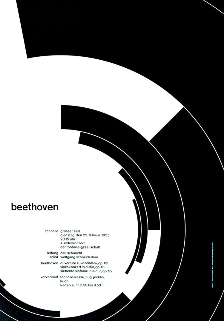
MÜLLER-BROCKMANN Found at: http://www.designishistory.com/1940/joseph-mueller-brockmann/
I looked at kinetic type:
Kinetic type is an animation technique, it mixes motion and text together to express ideas through a video. The text presented in the animation video conveys a particular idea or emotion.
Kinetic type is an animation technique, it mixes motion and text together to express ideas through a video. The text presented in the animation video conveys a particular idea or emotion.
- Words appear in an order
- TV adverst, blogs, landing pages
- From paper to screen
Personal Research:
Saul Bass, worked with hollywood film makers. He made a title sequence for the man with the golden arm. In Bass’ own words:
Saul Bass, worked with hollywood film makers. He made a title sequence for the man with the golden arm. In Bass’ own words:
“My initial thoughts about what a title can do was to set mood and the prime underlying core of the film’s story, to express the story in some metaphorical way. I saw the title as a way of conditioning the audience, so that when the film actually began, viewers would already have an emotional resonance with it.”
It is a very creative way to present pieces of text, is becomes memorable and the music used ties in with the motions, creating a recognisable piece of music also.
It is a very creative way to present pieces of text, is becomes memorable and the music used ties in with the motions, creating a recognisable piece of music also.
Seminar and Personal Work:

The seminar following on from the Type lecture, focused on a Stencil typeface, created by Joseph Albers in 1926. Albers wanted a style that was very simplistic and easy to read, a very legible typeface, so he produced a stencil for the alphabet, using only 10 simple shapes. We were given the task of displaying examples of the letters, I have put together my results (shown above). Most letters were easy to produce and put together, however others did not work quite as well, proving difficult to use with the modern day alphabet. Although it was proven difficult in some cases, this stencil design is very stylish and does present a very contemporary typeface.
Albers taught at the Dessau Bauhaus, there he designed a series of stencil faces. Before his teaching years, he was a student at the Weimar Bauhaus.
The typeface I looked into in the seminar is based on a limited palette of geometric forms combined in a size ratio of 1:3. Drawn on a grid, the elements of square, triangle, and circle combine to form letters with an economy of form. His idea was never intended for text, he wanted the face to be used on posters and in large scale signs. I can understand why this text wouldn't work on a smaller scale, used as body text perhaps. The shapes in the typeface and very precise and work better when enlarged.


