Monday 30 January 2017

Same, Same but Different: Lecture With Rob

Structure, chance and algorithms in a selection of visual and graphic art was the today's lecture topic. Graphic designers and artists use their own ideas to inspire their own work, as well as referencing other pieces of art. It introduces a certain amount of their own taste and opinion that creates certain styles. However, artists and designers do still experiment with algorithms, creating unexpected results - taking away their own intentions, relating to the pattern formed in nature.

Following patterns formed in nature, The 'Fibonacci Sequence' is a series of numbers, where a number is found by adding the two numbers before (0, 1, 1, 2, 3, 5, 8, 13, 21, 34 and so forth). The golden Spiral is also a form on nature, understood as 1: 1.618. It is derived from the Fibonacci Sequence in which each number is the sum of the two numbers before it. The difference between any two numbers in the sequence isn't always exactly equal to 1: 1.618 but close. 

Joe Gilmore / Tom Betts

A collaboration to create 'rand ()%' is a departure from many of the other works presented as Dots & Lines. While most of the pieces in the exhibition use imagery to challenge our conception of what a score can be, rand ()% offers a powerful yet invisible notion of a score. Rand()% is also an automated net.radio station streaming generative music.

Kenneth Martin

Chance & Order - They typify Martin's commitment to simple sequences 'like the notes on a piano; and a few simple rules producing results which 'could be like a fugue.' He creates his pieces of work through the chance of picking numbers from a hat that help him decide where he would strike different coloured lines on the page.

Darrell Viner 

Viner was a pioneering sculptor that worked with movement, he was also a pioneer in the field of computer art. He originally turned to computers to pursue his interest in movement and animation and applied technology to kinetic sculptures. 

Joshua Davis

Davis is an American designer, technologist and author/artist in new media. He is best known as the creator of praystation.com and uses Macromedia Flash and Processing as tools to create art. I liked Davis' work the best out of all the artists, working with plenty of colour and different patterns to create exciting visual compositions. 

Darrell Viner

Kenneth Martin


Joshua Davis

Same, Same but Different - Sequence

After Rob's lecture we created a piece of work that was produced by our own experience of chance. Numbers were spread across a page, connected by lines, which could not intersect with others. The piece of work was a game for two, the first player connects the numbers that are odd, and the second player connects the even numbers. An effort was to be made to keep areas open so more lines could be drawn on the sheet. A lined drawing was achieved by the end, with no lines overlapping each other. It was an interesting game that became quite strategic, and created very much by chance. 

Thursday 26 January 2017

Typography Transcription - The Beginning

Over this semester as part of my Process and Production Module, I will be creating and manually constructing fonts/character fonts. To introduce the focus, we watched a few videos relating to typography, the typographers and how they produce specialised fonts. Using references of our own, we transcribed shapes to make letter forms and characters, using the letters 'anesg'. Below are pictures I took of my work, and a few pieces from other students once the work was stuck on a wall to present. 

A3 sheets, or graph paper were available for us to use; I chose to use graph paper, helping me with measurements and sizing of each letter. I also used, markers, colour, and pencil for my last idea. The reference I used to produce my first letter sequence,  is shown in my photographs. As you can see, I have created the same technique and use of style, to produce my uppercase, jagged lettering. The second example I designed, used the red triangle I found as part of a piece of existing work. I created an overlapping effect for each letter, covering parts of the lowercase type. My third example is hard to see in these images as I only used pencil lightly for a sketchy idea. 

I enjoyed this task, and will enjoy the module this semester as I love typography, and designing new style and techniques. I produced my own font as part of my college course, so I will be looking forward to creating a font of a higher standard throughout this project. 


Industry Brief: Transformation as a Design Process

Sketching, and producing a range of ideas was today's target for my Foundation Studio project. At this point, I hadn't really looked into any of the books that were listed for the brief. The adult fiction cover award, To Kill a Mockingbird, I was familiar with; I read the book as part of my English GCSE's. Therefore in this session, I focused on using a central idea relating to the book, creating an initial description/state and drawing a main idea down on paper. I used thumbnails and sketches, but also included key words, and unique points that I thought would help with my research.

Transformations: Explore the unexpected
  • 'Invert' one element {design, movement, theme, stance, audience, etc} and explore the new potential outcome
  • Go back to original idea and do this again
  • Transform the new outcome, moves you a long way from the original


Describing Images

Today's seminar was the first time we had brought part of our essays in, for another student to read the work  and make critical suggestions. It was a close reading task to give us a look into other peoples work and how they are writing their essay. We then got into small groups to discuss the work we had read, and why we thought our marking was the best feedback for the author.
We collected our writing from the editor, to then make amendments where needed.

Homework for this lesson was to also bring a few images that could be useful throughout our essay; we wrote down descriptions for each image, maximum of three sentences, making them concise and exact (clipped). The images were shown individually on the board and as a class we had to match our descriptions to the images. We learnt that good descriptions, thinking detailed and further into the image will help open more doors as to why the image exists.


Monday 23 January 2017

Motion Theory: Context, History and Theory

Motion graphics are pieces of digital footage that create an illusion of movement, they are usually combined with audio for use in multimedia projects. Motion graphic designers communicate to the audience through these animations; I have created small motion graphics in my After Effects workshop recently, I tried to make sure the sounds I imported, reflected the movement or images inside the animation.


"You can add up the parts, but you won't have the sum" - Leonard Cohen.


Sara explained that this idea represents motion graphics effectively, in the way that you can have an idea in your head, but you need to see the piece as a whole, knowing where you want it to go, so that it can be refined with success.

The video that I have linked below, is an animation by Oskar Fischinger, a german-American abstract animator and painter. This truly represents the meaning of motion graphics, it is a creative innovative piece, exploring colour, shape and form. 'Kreise (excerpt)' means 'circles' in German. The elements shown throughout the video move with the music imported into the animation. The flow of the circles matches the flow of the music. 


I want to compare the animation above to a very contemporary piece of motion graphics material, 'Spherical' by Ion Lucin. It starts with a very simple idea and executes it into a complex idea, becoming very mesmerising. It is an extremely interesting piece, very refined and creating a mood of relaxation. Stylistically and technically refined, the video creates a difference sense of feeling to the first referenced video. Both pieces convey that even the simplest of shapes can convert into something that looks complex, changing our perspective of the shapes included. The music for this piece is very different, and the elements are more technically refined. The animation is extremely creative, using up to date techniques, and a colour scheme that is very sophisticated to match the creation. 


We were then shown another animation, Strings: J.S. Bach - Cello Suite No.1 - Prelude. He has created a visual response to the music. It is slower and more melodic whilst watching the graphics, compared to listening to the sound track on its own. This animation uses classical music with a deconstruction of every note to create a visual representation, seeing the notes appear to get slower. It was said to be delicate and simple, disorientating the viewer. The music and the motion graphics work extremely well together, and showing one without the other does not create the effect that both have with each other. 


While doing my own motion graphics research, I found a video I really liked on youtube. 'Enjoy the ride' is a simplistic yet distinctive animation set with a up beat audio. Robby Prada, the creator of the motion graphics piece, has sophistically put together a video containing a small ranged colour scheme, and shapes to create convenient illustrations to match the title of the animation. It is very clever, and the camera drops down the page as the shapes lead on to new illustrations. I have linked the video below, as I think this is a very well put together motion graphics piece, that interests the audience with an audio that puts a smile on their face.

Thursday 19 January 2017

Adobe Interactive PDF Workshop

I was now back to Rob's Adobe Creative software workshop session, and today we were looking into creating an interactive PDF document on InDesign, this meant that we could attach buttons and videos onto the pages in order to present it through a PDF. We focused upon basic techniques with which to produce an interactive portfolio, helping us to present our design work, research and development materials, in a compact and effective manner. The session included an overview of the key media types which can be embedded into the PDF file, considering video compression (via Vimeo) and basic audio editing (Audition CC).

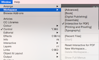
Setting up the InDesign document was the first stage, making sure it was standard screen size, 1920 x 1080 pixels. I also needed to make sure the workspace was set up so it was easy for me to edit the interactive document. Therefore I went to Window: Workspace: Interactive for PDF. This gave me a lot more option on my side tool bar compared to using 'Essentials' which is usually how I set up the rest of my documents.


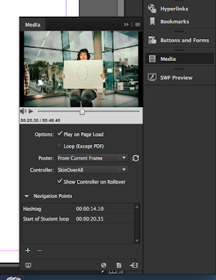
A video that was created before hand, was put in a folder that we were all able to insert into our documents, this video was used as the interactive part of the file. It shows a slideshow of photographs, involving students in different positions, holding pieces of paper with text or illustrations on. Once this video was selected on the InDesign document, I could select the 'Media' option on the side bar, and tick the boxes necessary, including 'Play of page load' and 'show controller roll over' which meant when the mouse was hovered over the video, a control bar appeared, provided me with the option to pause, play, or skip parts of the video - just like a youtube video. 


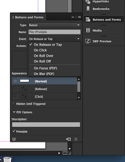
Buttons were needed to control the video, so I designed a button in Photoshop and placed it onto my Indesign document, this button was there to simply play the video on the click. I created this effect by using the Button and Forms setting on the left hand side, I selected a navigation point (the start of the video) and set the video to play from this point onwards using the 'On release or Tap' option. 

Now I had a button that played the video from the beginning, I thought I'd create a button which played it from a point of my choice, such as when the students held a piece of paper up displaying the hashtag for 'HUDGDA'. I used the navigation point setting again, and set the button to play from the HUDGDA, which was 14 seconds in. 


As well as creating buttons, we created small thumbnails that presented parts of the video, once these thumbnails were clicked, the video would play from that point onwards. This technique was designed in the same way I created the 'Play' button. As you can see, below are the thumbnails I decided to use, against the large video on the right. Underneath these images is the settings box I used, showing all the individual settings I changed to manage the interactive document. I made sure all the images were changed to buttons, and stuck with the setting that let them play on the release of the mouse. I linked them to my video, and made a number of navigation points that I could then link individually with the right thumbnails. I didn't manage to finish this task throughout this session, I found it quite hard so it took more time than anticipated. I have never set up and interactive PDF document before, this was my first time, and I hope to use the techniques and skills I have covered today, in future portfolios. 


Introducing the Second Brief

My first Foundation Studio Practice is now complete, and today, our second brief of the first year was introduced to us by Rob. A selection of three competition briefs are available to us, they invite us to work with a clear industry focus upon graphic design or animation in a professional context. This project will enable my practice to become outward facing and contextualised in relation to one of the industry briefs that have been made available.

Over a period of 6 weeks, I will research, evaluate and define a range of issues, and discuss these in relation to the production of a body of visual work. I will produce work that communicates my ideas and applies appropriate aesthetic and technical awareness. I will produce background material in the form of research and concept development, to clearly support my final outcome. The briefs are listed below, the penguin student design award being the chosen brief I am taking part in.

Penguin Student Design Award 2017
This brief is our suggestion for Graphic Design students.

RSA Student Design Awards 2017

Brief #12 Moving Pictures
This brief is our suggestion for Animation students.


ISTD Student Assessment 2017
Project 1 - Banned Books
This brief is our suggestion for Graphic Design & Animation students.

The Penguin Random House Student Design Award is an opportunity for students interested in pursuing a career in design to experience real cover design briefs first hand. Below is a screenshot I took from the Design Award website, showing three different books that I can design, including an adult fiction, an adult non-fiction and a children's cover. I will start my research by looking into all three books, comparing and explaining why my chosen cover would be the best suited for my foundation studio project.

Essay Analysis: Examples

To boost our understanding as to how our essays should be written and organised, this mornings seminar was there to focus on existing essay examples. We quickly re-capped previous seminar subjects, such as genealogies, strong opening line, referencing and so on, to open our minds and remember what to include throughout our writing. 
The essay example was sectioned and handed out across the class page by page. Although the essay contained good points and had descriptive writing in it, we as a class noticed that it didn't have all the necessary information in order to convey the correct message. A few bits of referencing were missing, and a lot of opinions were given rather than using quotes and facts. I also thought the writing was long- winded, there were a lot of sentences that could of been shortened or cut in order to add more useful information into the over-all word count. 

The advice that we decided on for ourselves, was to give a definition of subcultures at the beginning of the essay, don't tell the reader what will be included in our essays, and make sure references are used wherever appropriate.

I got a good understanding on how to correctly structure my essay from this seminar, making sure that my opening and conclusion are concise. Limiting my research will also help with going into more detail with one matter, rather than changing the subject too many times and not adding enough information for the reader to enjoy reading. 

Monday 16 January 2017

Essay Read Through - Consumer Culture

The seminar after my Branding lecture, included looking into an essay that had been written by a previous student. This essay linked to the lecture held beforehand, as it was about consumer culture as a creative process (also linked to subcultures which is the essay question I have chosen to write about). It discussed the connection between popular culture and sub cultures. We were to read the essay through, making notes for the following set tasks:

  • Highlighting and pointing out each section of the essay - introduction, main body and conclusion
  • Showing where the writer should've used referencing
  • Showing where the writer had used good language in order to covey her thoughts
  • Writing three sentences which describe the whole essay


From the essay, I collected a few pieces of vital information, such as consumers are manipulated by the advertisement and marking world, it creates a hyper reality that we have to question sometimes. To finalise, consumption plays a vital role in the expressive nature of which we consume materialistic products - it is all a creative process. The essay was poorly referenced, and to me, was not worded/ put together correctly. From this, I was given an insight as to how my essay should be produced, I want it to be well written, with subjects that link together, without opening new paths to pointless information. 


We discussed as a group that APA6th referencing is important, it is a vital skill within any university course, and we should display our references in order to credit other writers or researchers when we link their writing to any similar nature throughout our own work. 

Branding - The meaning of life


Today was the first day back after christmas, and the lecture this afternoon with Tracy focused on branding within art, design and consumer culture. We completed a short alphabet branding quiz to start with, guessing the company names by looking at the recognisable icons/symbols. We then shortly focused on Brain Eno, a British musician and music producer. He quoted:

"Culture is everything we don't have to do. We have to eat but we don't have to have cuisines like Big Macs or Sushi. We have to cover ourselves against the weather but we don't have to be concerned whether we put on Levi's or Yves Saint Laurent. They 'have to' activities are functional and the 'don't have to' stylistic - The main basis on which we make choices is in terms of stylistic differences."

A brand is a visual, emotional, rational image that you associate with a company or product, it has an extremely powerful impact on our beliefs, behaviour and emotion. Consumer Culture is focused on the selling of consumer goods and then, the spending of consumer money. A large part of what we do and value, revolves around the things we all consume. Advertisements are displayed everywhere, billboards, online, TV, posters etc. and they force us to consume the things we like. For example a Costa advert will make us want to buy the new in season drink - this makes 'us' the consumer for buying the product advertised. The culture of consuming is considered oppressive and manipulative as companies use their branding to attract their customers, they are creating profit. 20% of the worlds rich take up 80% of consumptions, therefore only a small proportion of people are using most of the worlds resources. we consume and digest information at such a rapid rate compared to countries that don't have access to the resources we have.

Products and advertisements are used to target us, it allows us to feel like we fit within society; therefore we keep consuming. 

Barbara Kruger is a designer, she started out as an editor for large magazine corporations. She produced collage images that questioned moral, society and consumerism. Her designs are often large scale pieces in galleries or on billboards. 


Barbara Kruger, I shop therefore I am
(source:http://www.arthistoryarchive.com/arthistory/feminist/images/BarbaraKruger-I-Shop-Therefore-I-Am-II-1987.jpg)