Thursday 16 February 2017

Being With a Book

Covering last weeks subjects, we went over a few ideas that were raised, such as essay themes, tasks, thoughts, reflections, responses and inspirations. We were asked to bring in two books from the library — ones that we have not used or referenced before, and textual. The other could be more imaged based, but the other must be more textual.

Before looking at the books we all bought in, we exchanged our essays with each other, as we have in pervious weeks. We wrote on the paper, making critical and productive comments, focusing on engaging, concise and accurate writing. As told before, we need to read the piece of work at least three times to make sure we pick up on elements we wouldn't of originally. 
Exchange your writing with someone in the room.

The first new task of the seminar, we introduced our books to other students, we explained how we found the book, what it was called, the author, and anything specific from the book that we found interesting. I made notes of my books, and also wrote down the details I was given about other students books. It was interesting to listen to other peoples ideas and themes linked to their essays and how they would use the books throughout their planning and writing. 

Using books as well as internet resources in our essays will help to broaden my inspiration. No one should hand in an essay with only internet resources. Book referencing: For text, read through the material you have. Jot down quotes, page numbers, and interesting content. For images, write descriptions that are creative and hold the reader's attention.

Our task for the next few days is to keep writing and editing our essays. I need to keep the reader in mind, remembering to contextualise the essay in graphics, using examples to illustrate my point, using references whenever I make a statement, and using my newly developed editorial skills. 

Typography Transcript Development

This weeks Process and Production session was back with John, using our physical studio module to manually create and construct a new font. The focus was introduced to us during the last session, watching type related videos, and creating shapes/fonts from inspiring reference images. I created three designs that used elements from the images printed out for us, and today, from these fonts, I produced the full alphabet using the same techniques and styles. 

I used lined paper and pieces of graph paper, to keep my letters tidy and the same size. I started with the rigid, straight lined font; this was my favourite from the last session. I created a rough look of the full alphabet, that I can come to next time and develop/tidy/finalise. I also produced the full alphabet for the style using small triangles on top of the contemporary styled, lower case font. I don't like this design as much, I feel as though it wouldn't be as useful and popular as my first outcome.

I struggled producing a third design, because my third style I created in the last session, wasn't worthy of re-doing. I looked again at a few of the referencing images, to then come up with a font using circular lines, with double lines on the corners of each letter. This would be a good font to develop further and finalise, I feel like letters would be more consecutive and flow better together.

I am happy with each style, and look forward to taking one of the fonts to re-design, making sure measurements, components and edges are all identical.


Thursday 9 February 2017

Helvetica Publication


Today's Process and Production sessions was one of my favourite. To extend our knowledge of Adobe Indesign as a graphic designer, this session encouraged our thinking and practice in relation to the design and production of concepts for a design publication. First of all, we looked back to our Theory as Practice seminar, 'deconstructing Helvetica', making paper-based typography statements that represented a re-imagining of the letterforms that are contained within the word 'handgloves'. Our creations were scanned and put into a folder for us to use this lesson. 

In groups, we were to design a publication that uses full colour on the front cover and back cover, and single colour (monochrome) interior pages. Specified dimensions were given to us to work with, and from then, we could design the pages using the Helvetia scanned creations from the seminar, as we please. This learning helped us to develop and discuss design concepts in a short space of times, and also practice professional quality artwork production in InDesign and output client-ready proofs as PDF files with bleed and crop marks. We started the design process by working on paper (sketches, thumb- nails) and discussed/evaluated ideas before producing artwork in InDesign.


Publication specification:
Page dimensions - W 152.4mm x H 228.6 mm Spine - 7 mm
Cover overall - W 311.8 mm x H 228.6 mm Bleed - 3 mm all round

Supply:
Full colour cover artwork.
Minimum of five interior double page spreads. - as pdf files with bleed and crops.
Time allowed, 3 hours


As a group, we were to consider everyones role in putting the publication together, whether it was thinking of a name for the document, creating the front page, or producing a specific found style that could be used throughout the pages. Our group, did not stick to one grid throughout the development of the publication. We struggled to develop a starting point, therefore we fell behind for the first part of the session. Every member of the group designed a few pages each after thinking of the name for the Helvetica publication. Looking back now, I do think our planning as a group could of been better, I think we should of created a look for the interior pages to stick to, rather than going straight in, designing the pages to our own liking. Things we could of stuck to for example, was the alignment of the paragraphs, making sure all the lines ended the same using the 'justify' setting, or making sure all the text was aligned to the left. 
Below are our pages, including the coloured front cover, which did not seem to correctly save as a PDF with all the elements as we placed them. Unfortunately, main illustration on the front cover has a white background - on the InDesign document, the white background does not show. Apart from this fault, our designs are shown fully below, for the time that we had to work together.


The two double page spreads below were my designs. The first page shows a lot of negative space, I have used this space wisely as the large piece of typography displayed as the length of both pages is very detailed, using smaller pieces of text. I enjoyed creating this technique - and I produced it using the 'Draw inside' tool in Adobe Illustrator. I placed pieces of text inside each expanded letter, making sure the outline strokes were turned off so only the small text displayed the letter form. On the right page I have used two columns, justifying the text so the alignment for each line started and ended at the same point. The subheading has been placed to cover the length of these columns, keeping everything in line and tidy. 

The second double page spread I created, used the 'Helvetica' art work students produced in a seminar just before christmas. I have placed these pieces of work inside different sized rectangles, and placed them onto my pages, landscape and portrait. I have overlapped one piece of work, placed at the top, over both pages. This is to bring the pages together and show the whole spread is connected. Again, I have used a few paragraphs of writing, however only using one column. This column lines up with the right column in the page above. The text would look out of place and discontinued if different widths of columns were being used. Overall I do like my designs and I was given the chance to include my own skills and techniques into a piece of design work. Practicing layout is important to me, it is something I would like to take further in a career. 


In my own time, I decided to look through some existing design layouts that also use Helvetica as a design aspect, or as part of the text elements. These design are all covers of existing publications. It is coincidence that they all stick to the same colour scheme, however the designs are all very powerful but simplistic - the colour scheme helps keep to a minimal style. Each of the designs all include the word Helvetica, whether it is landscape, tilted on its side, reflected. The word can be used so many times in so many different ways. Only shapes and typography are used throughout the pieces of work I have found to inspire me. They work extremely well to keep the focal point on the font, rather than using other features or illustrations to take away the importance of the type. Techniques have been used to slice the letters up, or the letters have been expanded in order to be placed at random. Either way, all these designs include great layout choices, sticking to a minimal group of elements. 


http://trosious.deviantart.com/art/Helvetica-Book-Cover-2-158977718


http://www.coroflot.com/bettinna/Typography


https://uk.pinterest.com/italoalesil/estilo-internacional/


https://www.etsy.com/listing/237655497/helvetica-type-face-a3-poster

Summarising - Descriptive Writing

Starting our lesson once again with peer editorial, we exchanged writing, making critical and productive comments on the work we were handed. I made sure I made comments that were positive, letting the student know where the writing was clear and concise, but also adding advice for where I thought the writing could of been improved. 
We then gathered in groups and exchanged diagrams that we had been using to help us with our essays. Whether they were digital with images, or written mind maps, we spoke about the work we had produced and how the ideas/sketches/images were interpreted into our assignments. This exercise was very useful, it let us open up to other students, making sure we understood our own work enough to describe our ideas to others. We also had a feel of how other students planned their work and what techniques they produced that maybe we can take and use in our own way. 

The third section of this seminar, was an exercise that included practicing descriptive writing. We watched two clips, from these clips we produced four small sketches that represented different scenes, like a story board. For each of the four key frames, we connected a descriptive sentence/ points.

Monday 6 February 2017

Animation - Imagined Lives

In todays seminar we looked into images telling a story. We were given a series of images, and then had to describe what kind of life the person in the picture would lead. 

  • Mona Lisa, Da Vinci - Moustache and beard, L.H.O.O.Q, Bidlo: Making fun of herself, bearded lady who travels with the circus.
  • She likes to go to festivals. Passion for accessories. 
  • Cannot breath 
  • Loves pizza. Lucian Freud, social worker. 
  • 17-19 years old. Holding an Ermin. Da Vinci. She was married to a powerful man. 

Each image contained symbolic elements, giving an impression of the time the image was captured. A picture is worth a thousand words, this task was the perfect example to show that.

This task can be used throughout my book cover project, I would like my imagery to tell a story and interest the audience. I want it to communicate a clear message as soon as people lay there eyes on it. 

Animation Heroes - Defying Cultural Convention

To start today's lecture, we completed a quiz on Disney films, video games, and Tv based questions. There is a lot of underlined subjects that we aren't all aware of when watching animation. We looked at how animation effects us and the theories used to describe it like, theories of play:


  • Theories of play: Child Development theories: Started in the 50's. Sigmund Freud focussed on abnormal behaviour, children beyond the norm with delayed ability  B.F. Skinner looked at the idea of children's behaviour, determined by its consequences which make it likely that the behaviour would occur again. Thats where we built our understanding. More concerned on the brain. 

  • Social Development theories: Bowlby - Attachment Theory' Looking at parents and their relationships with their children. Bandura - 'Social Learning Theory' observing and taking on behaviours which reinforces satisfaction in others. Piaget - 'Stages of cognition' mental processing and recognising how children got some understanding to become active learners, they are naturally curious and driven to learn new things for themselves by doing new things. Lev Vygotsky - Sociocultural Theory' looking at imagination, children are unable to do certain things adolescents can e.g. riding a horse. Therefore when children grow older their imagination starts to change and become different. Children can't do things like ride a bike, or fire a gun. They have to rely on imagination. Growing up provides you with the ability to do more things. 

Culture and emotion:

  • 'Popular culture is a category which floats ambiguously between the anthropological and the aesthetic' - The idea of culture (Terry Eagleton Oxford Prof)
  • Goleman 'Emotional Intelligence' - HAPPINESS is a universal positive core emotion 
  • Kobayashi & HarĂ¡ ' Facial Recognition' - Surprise/Fear/Disgust/Anger/Happiness/Sadness
  • McCloud 'Storytelling and Meaning' Meaningful connections and communication through animation and products


Playful politics:
Reflects what is going on in the society, portraying it in a way that lets the audience know they are joking and having fun. It gets an alternative message across. Playfulness defies the existing narrative, it gives people a chance to change their opinion on things, animation allows others to read another message. The entertainment value also has a purpose. An example of this would by The Recession - 'Top Cat' showed the view of homeless people trying to get through life with less money. Transparent, our defences were down. We were more open to changing our attitudes. 


Yogi bear - Used to live on safari park. Steal picnics. 

Growing helplessness - Cartoons. We could see it was happening in real life. 

Sofa satire - Family guy/ Simpsons
Prime time tv animations. Simpsons very slated in the early days. Learn to embrace homer, learn to use the opposite behaviour. 

Girl Culture - All things nice, animations such as My little pony, Dora the explorer, Powerpuff girls and Strawberry Shortcake. Develops a half our advertisement to get the girls to things related to the tv programme, purchasing merchandise such as dolls, horses etc.


Authority - South Park: Touches on subjects no one else wants to touch. Looks into serious issues that have not been looked at in America and turns them into bold subjects that continues to pass the messages on through the audience. Very outcutting. Gay marriage etc. 


Us & Them Branding - SpongeBob SquarePants and Fairly Odd Parents cater too all needs and make it something that you can watch repeatedly suggesting that there is something in it for our children to understand and causes adults to look deeper into the show to understand it.

Thursday 2 February 2017

Kinetic Typography Film

Before my After Effects workshop with Sara this afternoon, I made sure that I had completed the homework that was set for the start of this session. My task for the session was to produce a ten second animation, presenting a font of my choice, and any information/description I had gathered to put into my slides. So my homework to bring to this class, was to plan and put together the slides I would be using. In the last workshop, we watched a few examples of videos, based on typography; the slides weren't full of text, they presented a nice flow of boards using effects, fonts, and shapes/illustrations. 

From past animations I have created, I have realised that using ten slides for a ten second animation doesn't work well when the slides include text. The audience would struggle to read each slide, given one second each. Therefore, I designed seven slides that I have then put together for a ten second duration. 

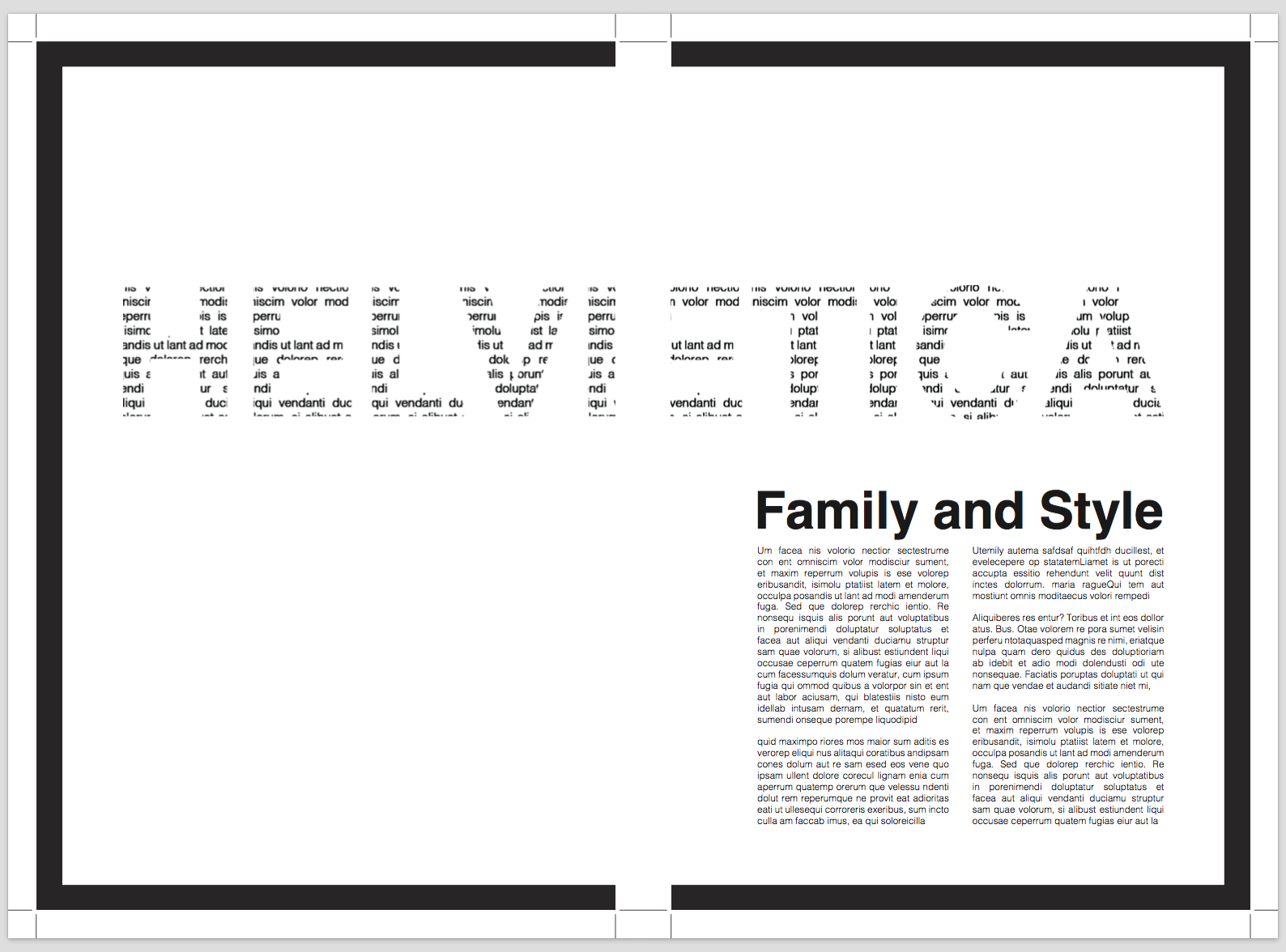
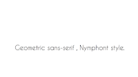
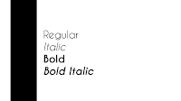
I chose a font that I had previously used in one of my college projects, Caviar Dreams. This font is a sans serif style, very contemporary and geometric. (I prefer modernised fonts to classic, serif fonts.) The colours I chose to use throughout this animation were very basic and simplistic, black and white. Too much colour and background imagery can take away from the creation of the font and the importance of the style the font presents. So to start, the first two slides would hold the name of the font, and show the audience the style the font uses. I placed this in the bottom right corner and left the negative space so the focus was on the name only. The colours would then switch to a black background with white text, and I chose an effect on the programme to switch slides in the best form, that I will show further on in the post. The third and fourth slide, present a short sentence, explaining what type of style Caviar Dreams is. Moving on to the fifth and sixth, I have presented the different weights and styles the font family holds, including regular, italic, and a bold in both. The final slide includes the creator of the font, with the same black panel down the left side. I saved my slides, so I could then start to put together the animation. Below are small screenshots of the layouts.


Sara refreshed our memories using After Effects, as the last workshop finished before christmas. We went through as a class, how to import objects and audio, and also going through the basics of how to use or adjust different effects, such as opacity, rotation, scaling, and positioning (creating a movement of an object or text). I used a few of these effects throughout my animation. Starting with the first slide, I used the positioning effect, found in the transform section on the text layer, and used the key frames to create an effect that made the text flow in from the side. This was a basic effect on the timeline, that helped start my animation off nicely. The screenshot below shows the timeline and the keyframes that I have placed, creating the movement from off the slide, to the right hand side. 


The change between the first and second slide is shown with a fading in effect. I used this effect so that the colours would gradually switch to look very effective. I have used the solid black background colour on a new layer, and duplicated the text, changing the colour to from black to white. I started the fade in of these two elements at the two second mark (using the opacity setting in the drop down 'transform' setting), enough time for the first slide to make an appearance. The first slides layers, were cut down to two and a half seconds using command ], so they would disappear for the rest of the slide (layer 11 and 12). These stages I have shown in the next screenshots. 


From slide two to three, I added an animation that shattered the black solid background, into the white background I added to start just before the three second mark. This white background colour also had a fade in effect on it using the opacity setting; making the brightness of the white get more intense as the black background disappeared. As well as this effect I found on the programme, I used the position, space and rotation setting on the white text on slide two. I used these and adjusted the settings so that the piece of text got larger and rotated round and off the page, in time for the next stage to start. Below is a screenshot of the setting I adjusted the text layer to.


Throughout this animation, I adjusted small settings and added effects to make small corrections for the video to flow at its best. The next stage was the sentence, half of which I had timed to appear with the white background. I started the second section of the sentence at four seconds, while the first section appeared at three seconds. I added a text transition called 'typewriter' to this part of the sentence, creating a professional, animated look to my video. I shortened the keyframes so the typewriter would increase the speed, leaving the full sentence on display for half a second once it was all typed. This also has a fade out effect and I cut the layers down at 5.5 seconds for the next slide (leaving the white solid background to run until the end). 

The last three slides all had the black panel, which I adjusted slightly, adding a small white line down the left side, just for more decoration. These elements had the 'Stretch Master Control' effect added, making them slide in from the middle of the screen. The styles then transitioned from the top, sliding down to where I wanted the text to be placed, making sure they started there transition once the black column had finished its transformation. These effects were all found in folders through the 'Apply Animation Presents' setting. Remembering to cut the layers down, I adjusted the timing of each keyframe using the drop downs on the left hand side of the timeline - making sure the timing of each slide fitted perfectly and was legible/clear. 

The last slide was fitted at just over 8.5 seconds. This was the creator of the font, and I used a text animation, flipping each letter one by one, adjusting the time of the animation so it ended before the ten seconds was over (making sure the full line of text was readable). 


I am really happy with my final outcome, you can play the link just below. I was given a task of producing a typography based film, following basic procedures, however the effects, adjustments, timing etc, I put together personally, and I believe I created an animation that portrays my new skills and techniques I have gained since working with Adobe After Effects. 


Caviar Dreams from Emily-Beth Phillips on Vimeo.

Collecting Library Inspiration

Given time to collect our own research, really helped me to produce a range of ideas as a starting point to the industry brief. We were in the library today, during our seminar time, and books were a very helpful, inspiring way to piece a few ideas together. Looking into similar books to the three covers we were given, I understood that thinking outside the box rather than looking for obvious illustrations or cover designs, worked better to produce a unique piece of work. The brief is asking for something completely different to the design that have already been used. 


Writing by Comittee

Marking each others work at the beginning of the class is a way to receive positive advice and critical ideas - as we can't receive a marking or productive comments from any of the tutors (early feedback). I look out for academic writing, engaging sentences and APA6th referencing. Re-reading the work at least three times will help us notice much more than just marking the first time round - this will also come in handy with my own work (re-reading to add more detail, or take away parts that aren't needed).


The task given last week to bring in for today's seminar, was to write down 3-8 words in connection to my essay. Individuals were asked to read there words out, if any other student had the same word, they would read there list of words out. This task was made to help students open up different paths and different ways of looking at there essays. It could give us new ideas that we were struggling to create for paragraph subjects ideas.


After that, we got into groups and were given a picture, we wrote down around 10 key words on a separate sheet, making sure these words were descriptive, creative and 'over readings'. These creative words need to be used in our own essays to describe images we reference throughout. 
The image and keywords were then passed onto the next group, for them to write a description of the image using most of the words our group had wrote down. We needed to be creative, making it emotive, experimental, abstract and unique.