Today's Process and Production sessions was one of my favourite. To extend our knowledge of Adobe Indesign as a graphic designer, this session encouraged our thinking and practice in relation to the design and production of concepts for a design publication. First of all, we looked back to our Theory as Practice seminar, 'deconstructing Helvetica', making paper-based typography statements that represented a re-imagining of the letterforms that are contained within the word 'handgloves'. Our creations were scanned and put into a folder for us to use this lesson.
In groups, we were to design a publication that uses full colour on the front cover and back cover, and single colour (monochrome) interior pages. Specified dimensions were given to us to work with, and from then, we could design the pages using the Helvetia scanned creations from the seminar, as we please. This learning helped us to develop and discuss design concepts in a short space of times, and also practice professional quality artwork production in InDesign and output client-ready proofs as PDF files with bleed and crop marks. We started the design process by working on paper (sketches, thumb-
nails) and discussed/evaluated ideas before producing artwork in
InDesign.
Publication specification:
Page dimensions - W 152.4mm x H 228.6 mm Spine - 7 mm
Cover overall - W 311.8 mm x H 228.6 mm Bleed - 3 mm all round
Supply:
Full colour cover artwork.
Minimum of five interior double page spreads. - as pdf files with bleed and crops.
Page dimensions - W 152.4mm x H 228.6 mm Spine - 7 mm
Cover overall - W 311.8 mm x H 228.6 mm Bleed - 3 mm all round
Supply:
Full colour cover artwork.
Minimum of five interior double page spreads. - as pdf files with bleed and crops.
As a group, we were to consider everyones role in putting the publication together, whether it was thinking of a name for the document, creating the front page, or producing a specific found style that could be used throughout the pages. Our group, did not stick to one grid throughout the development of the publication. We struggled to develop a starting point, therefore we fell behind for the first part of the session. Every member of the group designed a few pages each after thinking of the name for the Helvetica publication. Looking back now, I do think our planning as a group could of been better, I think we should of created a look for the interior pages to stick to, rather than going straight in, designing the pages to our own liking. Things we could of stuck to for example, was the alignment of the paragraphs, making sure all the lines ended the same using the 'justify' setting, or making sure all the text was aligned to the left.
Below are our pages, including the coloured front cover, which did not seem to correctly save as a PDF with all the elements as we placed them. Unfortunately, main illustration on the front cover has a white background - on the InDesign document, the white background does not show. Apart from this fault, our designs are shown fully below, for the time that we had to work together.


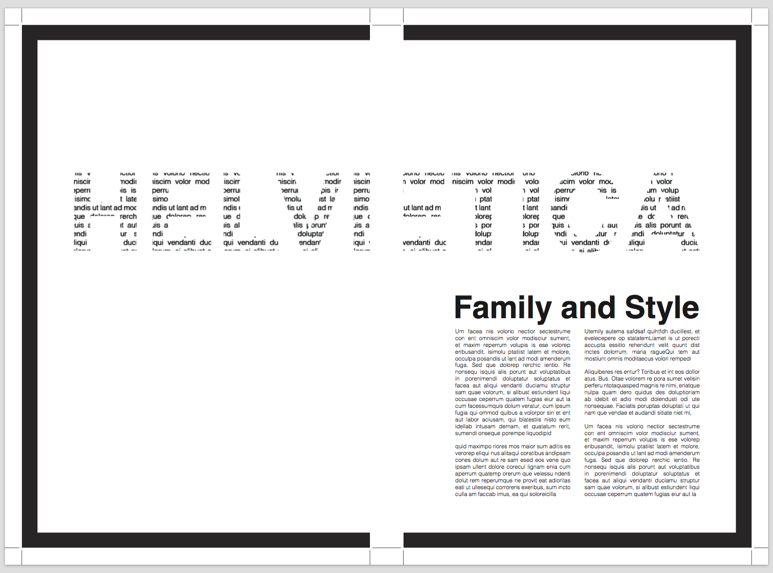
The two double page spreads below were my designs. The first page shows a lot of negative space, I have used this space wisely as the large piece of typography displayed as the length of both pages is very detailed, using smaller pieces of text. I enjoyed creating this technique - and I produced it using the 'Draw inside' tool in Adobe Illustrator. I placed pieces of text inside each expanded letter, making sure the outline strokes were turned off so only the small text displayed the letter form. On the right page I have used two columns, justifying the text so the alignment for each line started and ended at the same point. The subheading has been placed to cover the length of these columns, keeping everything in line and tidy.
The second double page spread I created, used the 'Helvetica' art work students produced in a seminar just before christmas. I have placed these pieces of work inside different sized rectangles, and placed them onto my pages, landscape and portrait. I have overlapped one piece of work, placed at the top, over both pages. This is to bring the pages together and show the whole spread is connected. Again, I have used a few paragraphs of writing, however only using one column. This column lines up with the right column in the page above. The text would look out of place and discontinued if different widths of columns were being used. Overall I do like my designs and I was given the chance to include my own skills and techniques into a piece of design work. Practicing layout is important to me, it is something I would like to take further in a career.

In my own time, I decided to look through some existing design layouts that also use Helvetica as a design aspect, or as part of the text elements. These design are all covers of existing publications. It is coincidence that they all stick to the same colour scheme, however the designs are all very powerful but simplistic - the colour scheme helps keep to a minimal style. Each of the designs all include the word Helvetica, whether it is landscape, tilted on its side, reflected. The word can be used so many times in so many different ways. Only shapes and typography are used throughout the pieces of work I have found to inspire me. They work extremely well to keep the focal point on the font, rather than using other features or illustrations to take away the importance of the type. Techniques have been used to slice the letters up, or the letters have been expanded in order to be placed at random. Either way, all these designs include great layout choices, sticking to a minimal group of elements.

http://trosious.deviantart.com/art/Helvetica-Book-Cover-2-158977718

http://www.coroflot.com/bettinna/Typography

https://uk.pinterest.com/italoalesil/estilo-internacional/

https://www.etsy.com/listing/237655497/helvetica-type-face-a3-poster